Kigai-Holt's Shouts
-
-
I'm flattered that you would like advice from me, and I'm happy to share :)
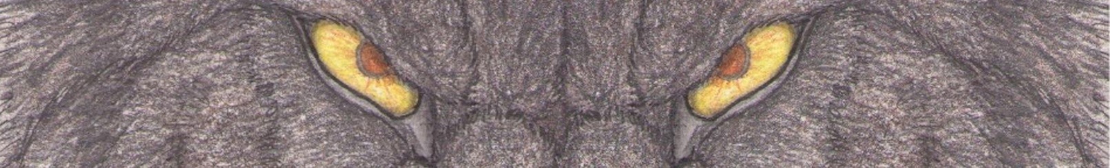
When referring to a real world color, such as wolf fur, I'm looking for the highlights of the creature, what's the brightest/purest color on the matter. Usually that comes out to be a light blue, beige, cream, or other. Keeping a light tough I create that as a base color, but of course only where it appears. Looking at a subject matter, it's hard to pick out the layers of colors, but you can indeed see them in real life.
With colored pencils, the paper can only take so much pigment, so keep your coloring light, and just keep adding on layers of the same color if you need that color to be deeper. This is better for adding layers, and mixing the colors.
I always hear that saying "NEVER use black," but what they mean to say is 'never use black by itself,' try to layer colors to make them darker/deeper, only use black if it's in the color scheme.
In short, perhaps the best advice I can give you is look at the world around you and try to decipher the layers of colors in a particular thing. For instance, looking at my own skin, I see a very light layer of beige perhaps, topped with hints of brown or pink depending on the shading/position of the patch of skin I'm looking at.
Definitely take the time to understand which colors can override what other colors. This is key to layering.
I can't really think of anything else off the top of my head, were there any other specifics you'd like to know?-
Thank you so much for your advice! For specifics, i just want to know if i have the right idea down with this peice. We've done art for the same person - which is how i stumbled across your work and your work is beautiful and more of what i wanted in my own art. This is a recent peice i've done, where i attempted to do fur with colored pencil but of course it still doesn't compare to how you've done fur in your colored pencil peices. I am beginning to question if paper type places a big role in the way colors mix and such. This is a peice i tried really hard to create fur one: https://www.weasyl.com/submission/963428/badge-commission-seamus-for-the-stardog . Am I on the right track? Do i have the right idea based on what i've done here? I am also curious of how you get such great quality uploads of your work. This was scanned on my scanner, but it sure looks...to me, it looks pretty bad scanned and in person it looks better to me.
-
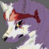
I think you're definitely on the right track. I've asked myself the same question about paper, right now I'm just using store-bought smooth bristol, and perhaps it would be better if I stretched it myself. Haven't tried that yet.
layering can help reduce that grainy look to some spots (like the bridge of Seamus' muzzle?). I still struggle with that, because you need to find the balance between saturating the paper, but also maintaining the color you desire. Sometimes, if I can't get it right on some test paper, I just put a similarly colored base down with watercolors or copic markers. That's a relatively new technique to me, still working out the kinks.
But yeah, even just putting down a base color of cream (hardly noticeable) or somesuch lightly with a pencil can help with creating more of a solid color.
-
The grainy look drives me NUTS. It is a major problem in all of my work. I'm glad to know that layering is pretty much what i need to do. Also, i LOVE bristol paper and that's actually starting to look like what a lot of artists are still using. I am thinking of going back to bristol paper because i liked the way colors sat on it. Does bristol paper hold watercolors very well? If i've understood you correctly, a way to reduce the grain is to put down water color first, then start layering from light to dark within a certain color scheme (Such as different shades of brown). I'm seriously considering trying that. I am wondering if the water color would help make my pieces pop. Also, i am sorry to be commenting up on your page. I am new to Weasyl. Is there a way we could message?
-
I'm sure there is, but I'm not entirely familiar with weasyl either.
Bristol isn't the best for watercolors, but it works alright. Stretching the paper is probably best. These methods won't eliminate the grain, but yes, it should reduce it.
-
Pardon me if i sound...like a clueless weirdo. But, how do you stretch paper? I've never heard the term!
-
-
-
-
-
-
-

You have some very awesome work here, keep it up! :3
-
Thanks a bunch! Sorry it took so long for me to say so!
-
-

Really nice weres!
-
Thank ye very much! Sorry for the delayed response!
-
-
Thank you for the watch! I appreciate it! ^^
-
No problem!
-
-

I'm LYCAN your work a lot
:3
-
dances around So happy to find so many artist that I like getting active here.
-
:D
-
-

Like I've said on DeviantART yesterday... I'm following you now.
-

Have another follower!
-
Thank ye!
-
-

Wolves and werewolves are cool! I like your art!
-
Truefox, and thank ye very much!
-
-
Thanks for following!!!
-
Right back at ya!
-
-

Very beautiful art you have. Can't wait to see more. It's hard to find traditional artists these days.
-
Truefox, thank you very much.
-
Link
TribalWolfhart
Not sure if you will see my comment, but I really would love some advice from you as your work is absolutely beautiful and inspiring. I would love to have some advice on how to use colored pencils to create fur the way you do in some of your pictures. I think i've attempted to do the same thing - laying colored pencil colors from light to dark over each other - but i am not sure if i will ever achieve that kind of look or if i'm doing it correctly. Sorry if you can't share any advice, i understand as you may want to keep your work skills more private. But, would really appreciate advice if it can be lent. :)