Sign In
Close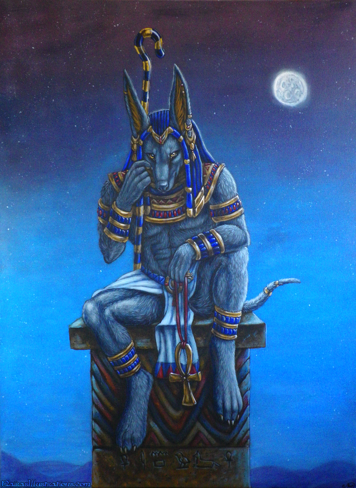
After 4 days, it is finally DONE!
Traditional painting, done for the Confurgence 2014 "Egyptian Nights" art show.
75x100cm Acrylic!
Submission Information
- Views:
- 1539
- Comments:
- 26
- Favorites:
- 53
- Rating:
- General
- Category:
- Visual / Traditional
Comments
-

-

Thankyou!
-
-

You are better with traditional than digital ;) amazing painting! Traditional art forever! XD
-
Aauuuuggh I hate painting in traditional though XD I think I am scarred for life after this painting :p I never want to paint again! Give me my digital back! Thank you though XD
-
Haha I know but this is an other way which makes trad even more fun xD keep it up :3
-
-
-

Nice work :)
-
Thanks! :)
-
-

Wowsers! I and probably half the rest of the furries in the world would give their left hind foot to have this to hang over their couch. You really shouldn't stop doing traditional paintings. They're much better than prints for enjoying as a decoration. And will probably be worth a lot more now and in the future than anything digital.
-
Oh I don't plan to entirely stop, it just definitely won't be a regular thing. The reason I even did acrylic paintings is because I know they are worth more than digital, this is in the hopes I'll raise some decent money for the ganglion cyst surgery.
-
-

Hot damn, good job! 8D
-
Thank you!!! ;D;
-
-
Turned out fantasmic.
-
Thankyou! ;D;
-
I read your facebook entry about folks preferring your traditional over digital. Yes, people do tend to appreciate traditional more as a general rule. But I think both your work is fantastic. I think people would be more appreciative of your digital work if you attain the same bold colors and crispness as in your traditional work. The thing about paint colors is they often come saturated in the tube and we need to desaturated them ourselves through mixing. With digital, there are thousands of colour choices and it can get difficult to choose a good mid value colour (not too saturated, not too desaturated). I noticed in your digital work you have a lot of soft, air brushed and desaturated colours (http://www.furaffinity.net/view/11731383/) . This is the only difference I see between the two mediums in your art.
tl;dr : peoples eyeballs are attracted to colorful thangggs. Your digital work is a bit desaturated (not a totally bad thing, could be a screen issue--I had this problem for awhile)
I hope that helps a bit? ;___;
-
Lol I used to make them TOO saturated! Argh XD
That picture looks pretty colourful to me though, the gold and blue really pop out. Maybe it IS a screen issue? BUT WHOSE SCREEN? ;D;-
Hahaha, whose screen indeed XD --on mine it looks pretty desaturated. But hey, its not a huge deal. It was just an observation I made that might be worth looking into.
I'm so self conscious about my digital art colours that I am aiming to get a great screen for it! http://accessories.us.dell.com/sna/products/monitors/productdetail.aspx?c=ca&cs=cadhs1&l=en&sku=225-4015&ST=dell%20+u2713hm&dgc=ST&cid=3852&lid=4857744&acd=123088137920560 Something like this! I also tend bother Balaa (who HAS a mega awesome screen for digi painting) to check my colors for me when I can! XDI also use this thing to calibrate my screen as much as possible: http://www.calibrize.com/ its the best I can do for now 9_9
-
Thanks for the links! I need to save up for a better screen or something. I have an alright PC screen but I just moved a sketch from my new samsung galaxy note to my PC, and on the samsung it looked really vibrant and on my PC it looked dull as shit D: aauugghgh!!! At least I could saturate it a bit on my PC though.
Are there any pics in my gallery that look saturated enough? What are the ones that stand out as being too desaturated? (i'm talking mostly in my recent works, as I'm still learning and I am using a new tablet)
-
-
-
-
-
-

That is awesome! :D
-
Thanks!
-
-

This is truely beautiful! I love the sky and how it changes colour, the feint hint of dusk or dawn. I also adore the detail in his fur and his solemn look.
-
Thank you so much! :D
-
Link
Tiamatart
That is fantastic work!