Sign In
Close
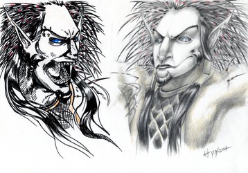
I feel a little bad for spamming my watchers with portraits and facial studies, but these were just a little too good to simply throw into scraps or not share at all. So I might be a little proud of them; sue me...
Similar to the previous facial studies of Creyroos, these depict a draconic character of mine using two different techniques in utilizing pens. The one on the left is detailed ballpoint (and only ballpoint) and the one on the right is a combination of Tombow pens, a felt tip pen and Staedtler pigment liners. Also more lighting practice, which I'm starting to get noticeably better at handling; still a long ways to go though. Oh, and I found out the first quirk on this new scanner; it picked up the purple pen on the right one and changed the original violet color to a....plum? I'm not really complaining, since it still looks nice, but I have no idea what the hell. I'll have to look into more settings on that thing.
This is probably going to be the start of some more studies with Creyroos and Quin, since I have some solid ideas of some scene practicing with them in it...
Submission Information
- Views:
- 422
- Comments:
- 10
- Favorites:
- 8
- Rating:
- General
- Category:
- Visual / Traditional
Comments
-

-

Don't feel bad, I love these. It's always a treat to see good pen work. I'm always amazed with what you can do with ballpoint pens. What brand do you use for your work, if I might inquire?
-

I'm only semi-sorry anyway; tis the price one must pay for watching me, and that is a lot of portrait and expression exercises. I have two different sets; one brand is Pentel R.S.V.P. pens, and the second set are Staedtlers (which I used on the portrait above). They both have their pros and cons, for example the Pentels are much cheaper and do not have as vibrant colors, but I noticed the ink flow doesn't clump as much, whereas the Staedtlers are a bit pricier and the ink is more "solid" and saturated, but I noticed the ink clumps more than the other brand (not that clumping really bothers me; I just accept it as another quirk of the medium). I got both easily at the nearby Office Depot.
-
I see. I must say, your work has really inspired me to pick up the pen as a medium. It may take a (long) while for me to accomplish what you can already do with a pen, but you've provided me with some aspirations. Keep on doing what you're doing, I'm eagerly looking forward to your next piece.
-
-
-

I just love the way you made her scales gleam on the left, and the way you made her look so striking on the right. But then I've said so much about this one to you already today.
Maximum everything.
-
Always appreciated, regardless.
-
-

Pfft, never apologize for spamming with art. It's delicious for the eyes!
The softness of the ballpoint pen on the left is beautiful. I love the small scutes under the neck and the reflective chest pieces.
-
Hah, indeed; you have a good point there!
Scales are so much fun to render and texture in ballpoint it's ridiculous. I tried to push the look of platinum or chrome in sunlight with the limited colors I have. They're definitely the best I've rendered thus far though. Thank you very much!
-
-

Geez, how dare you subject your followers to a bunch of art that's good and that you're proud of because it's so good.
And now I know where your icon comes from! :D This is lovely. I adore those faces.
-
I know, it's absolutely criminal what I put you people through. Criminal!
Yep; I've found it's impossible for me to make perfectly square portraits for icons (they always come out looking weird) so I've pretty much done away with making them in favor of larger and more natural-looking busts. I've also found that more than a few clients prefer it that way, since then they can crop the portraits how they see fit.
-
Link
Zeitzbach
You know how the Japanese says it.
Kawaiiii