Sign In
CloseI know it's been discussed but I really really really hate by capribebe
weasyl's thumbnail system.
I HATE it. It really dissuades me from clicking on any picture at all - my inbox is often around 100 submissions and I will usually only click on maybe 5 out of that number. Especially since so many people crop to just a character's face, so I'm usually just looking at an army of random portraits in the thumbnails in my submissions, which is just... mega boring?
I really hope this is something changed soon. Although from what I understand it's been like... 10 months since people started complaining about this. Let's not do things the FA way, okay, weasyl?
Journal Information
- Views:
- 704
- Comments:
- 53
- Favorites:
- 2
- Rating:
- General
Comments
-
-
-

a) weasyl auto-crops the picture if you don't do it manually
b) that does not solve my issue with other people's thumbnails-

Well, i kinda like the cropping system, but that is my preference, i find it tiring if i have to make a separate thumbnail for every pic i have.
-

that's cool if you like it. It'd be nice if there was an option to turn off thumbnails so people could continue to use them if wanted but people like me who don't like them would still see the resized image.
My issue is that super cropped thumbnails take away the context of the image, so if it's just a character's face... unless it's a really well-drawn face or something, I'm just not going to click it because there is no interest there for me. It reduces an image to a small segment and it's much harder to catch people's eye in that way imo. When the thumbnail is just a reduced version of the entire picture, though, there are so many more factors that could grab me; a nice background, an interesting pose, even just some dialogue... if I see those things I am 100% more likely to take a closer look.
-

I'd love for there to be a way to turn thumbnails off, more than anything. I think it's the forced square that bugs a lot of artists. I've read/heard a few people mention that they didn't think they'd have such an issue with them until they tried to make their preview look good in a tidy little box.
-
-
-
-
-

What's worse is when you click on an adult thumbnail, seeing only a face, and then end up with unfortunate unexpected consequences.
-

I feel your pain.
I donated and got in the first wave of registrations, and people had issues with the thumbnails even then. It's honestly the most common complaint about the site, and the biggest reason why I quit using it prior to the FA snafu. The literary system is aggravating, but I could live with it and stick around as a watcher/commissioner as long as the thumbnails are fixed. Right now, though, it's extremely difficult for me to find (and commission) new artists, so...
It's a shame, too, because the caliber of comments and users, so far, has been worlds above the average feedback on other sites. There's the makings of a great community here, so I hope it doesn't falter due to poor navigation.
-

The finding new artists thing is a big issue for me, too! 99% of the people I've watched on this site I either a) was watching on fa and they moved over here or b) was directly recommended to me by another artist. One of my favorite things to do on other art sites was to just browse around the recently submitted section and see what was around, and I found so many new awesome artists that way... weasyl makes it much, much more difficult. So many diamonds in the rough here!
-
-
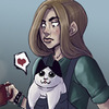
As a user who doesn't like to be greeted by random penis' and boobs when I browse art, but also likes the ability to see more maturely themed things based on composition, I like the thumbnail system. But on the same hand a lot of people don't use it to crop out the bits that others may not wanna have passersby see. I can understand your frustration though but really you can crop any square portion of your pictures you want and I feel it is the artists responsibility to use that to their benefit to showcase what they feel is the focus of the illustration. Again only my opinion and you all have very valid lovely ones. Though it would be nice if they maid the thumbnail preview larger, that way I feel people would feel more comfortable including more of the picture.
-

doesn't that also kind of backfire on you, though? I am greeted with unexpected dicks and boobs a LOT when I click thumbnails, thinking the image was something tame. I can definitely see the sense of thumbnails in the long run, and how it's really nice not have to upload a separate thumbnail. I agree with you about making the thumbnail preview larger, it'd be much more bearable imo if you at least didn't have to fit them into perfect little squares. D: It's a nightmare if you're uploading a particularly wide or tall piece!
-
-
I actually kind of like it because it makes me curious to see more and since most of the people I watch produce quality art I have no problem clicking through to see what else is there. It's kind of like unwrapping a present. I do think I might just do it for nudes and porn though, no reason to do it for clean stuff.
-

I completely hate it as well, ugh
I really like looking at what I'm clicking before clicking on it, not the other way around -

I got into the habit of just cropping to expressions because I do a lot of cough
adult
work and some folks are uncomfortable with seeing any of that at all no matter how tiny it looks in the thumbnailed image.-

I think one of the issues for me is you never know just HOW adult the image is a lot of the time from the thumbnail, you know?
like, say you have a thumb of a fox girl looking surprised, and the thumbnail has that little red corner marking it as an adult piece. Is it a cute tame pic where she is surprised because another cute girl is grabbing her bare boobs? Or does the foxgirl have a hyper dick and she is surprised because she is being attacked by little green alien elves that are sounding that enormous dick with a shit-covered bullet train?
If there was some kind of... tagging system you could view by hovering over the thumbnail or something, maybe, so you could see the tags "cute girls boob grab" compared to "train sounding hyper elf rape"... that would help my issue a lot, lol.
-
-

I agree so much. It's so boring to just look at a bunch of faces. And also the lack of difference in the submissions box when it comes to shapes and sizes... It's visually boring for art to be a row of very same squares if it's something that's meant to be clicked on :/
It's the only thing I really dislike about this site. I just don't feel like I want to bother with dealing with my submission box, which is disappointing since there is probably so much awesome art I'm missing.
-

I myself like the cropping. It makes the page seems way less crowded and orderly looking. Plus its a good way to make sure people actually click on your picture instead of just breezing over it
-

it's the opposite for me, if a picture is heavily cropped I am way way way more likely to breeze over it. I do agree it's nice how orderly it can make things though!
-

hm though i will concede that some ppl just don't know how to crop properly which to me simply means "Crop in a way that interests people to want to see the rest of the picture" (Not close ups of an eyeball, pff)
Its almost as if Weasyl has created a slight sieve that filters better artists from good artists simply because a better artist would crop more effectively than the rest, thereby earning more views
-
-
-

Oh man, I kinda second this.
I mean, I can see how it can be a good thing since it attracts that curiosity of clicking. But on the other hand, it can also discourage clicking, and with me that's the case q__q. At first, it was pleasant as it keeps everything tidier. But, ughhh I really like looking at composition, and y'know not everyone wants nor has the time to click every thumbnail just to see the full resolution. But there's no perfect site, and I still love weasyl regardless! I guess it may be just an adjustment thing, as well qnq -

Ugh I never click on anything either. Like I guess I enjoy that the thumbnails are a uniform size and shape so it's not some kind of weird, scattered arrangement, but I wish other people would learn how to informatively crop their images. I try and make my crops big enough that you know what's going on in the image. Zooming in on the face is just... silly.
-

There are more thumbnail fixes on the way. It didn't just stop at moving the text from the hover. :)
Currently, there are a bunch of fixes in the development queue for how to solve the thumbnail issue for everyone. In discussing this a lot with both artists and users trying to get to what they want, like you say-- and has come up in this thread a bunch-- is that there's just not enough information in the current cropped thumbnail. Whether or not this has to do with most artists being ignorant or apathetic to cropping techniques is essentially irrelevant-- it's to the point where there's frequently not enough information to be had from the thumbnails.
So here's what's currently planned, at minimum:
- If you don't care about cropping a submission, it won't automatically be cropped. As is the expected behavior on most sites, it will just be resized down to its longest side to fit the square.
- If you do care about cropping the submission, and you don't want to crop it to a square-- say, maybe you want to crop it to a rectangle-- you'll be allowed to do that.
There are some interesting auxiliary features that will come with just these two fixes, but since the primary problems all seem to stem from a lack of information, that's what I wanted to address. :)
Pretty much the number one irritation folks seem to have with the site is the thumbnails. We're slowly but surely trying to fix it. It'll happen. n..n
-
-

Yeah, I'm with the few users who were disappointed that we got rid of it, personally. I thought it was a cool little visual. Unfortunately, though, it mostly prevented people from getting information about the image, so it sadly had to be scrapped. We might find a way to bring it back at some point, we'll see. Right now we've got bigger fish to fry though... like thumbnails. xD
-
My suggestion was a switch somewhere in the preferences. The current way would be the default way, of course. Some people like me have a completely different browsing behavior and don't really care about that information (or get it somewhere else).
The new way made Snap Links unusable so I had to hide it with a custom CSS in Stylish =/
-
-
-

it's so awesome to actually get an admin response here, thanks so much for your comment! I'm really really happy to hear this is planned to be worked on in the future.
I know you're probably not looking for more input on the situation (I imagine you guys have heard it all), but something that might help would be to hover over the thumbnail and view the tags, to get a better idea of what the image actually consists of? Of course that would only matter if people actually diligently tag their stuff. Another option could be to hover and then the full-pic thumbnail comes up?
Best of luck to you guys and thanks for your hard work!
-

Oh, no, we're always looking for input! My primary role is scouring around the community and trying to figure out what it is exactly that people need, then prioritizing that and translating it into something our developers can actually write code around. That's essentially how the thumbnail roadmap came to be, really.
Balancing how much information someone should get before seeing the submission is a bit difficult. So far it seems we've erred on the side of "too little information." So some sort of preview in one way or another might actually be beneficial!
The kind words are appreciated! Tell @WeasylDev on Twitter how much you love them. That's pretty much your direct line to the development arm of the site. :)
-
-

UGH, i hate the thumbnails! i'm so much less likely to click on thumbnails than on full pictures. i also don't like how the initial inbox online shows up to 18 images of each type, and you have to go to a new page to look at all them and then have to back to see the others (Collections/Characters/etc). like, why is that even a thing? why can't they all by on the same page?






Link
xainy
I kinda hate it too. I usually don't make thumbnails of my stuff at all unless I think I can crop it in a way that still makes the picture make sense, but in a zoomed-in way. Plus, sometimes if I don't choose a thumbnail, Weasyl crops it so the character's head is out of the thumbnail entirely. -_-