Sign In
CloseBe brutally honest u//u by Happysorry
Costumers
For those who have been my costumers I would like to know if there's anything you would like me to work on to give you much better service?
Fellow Artists
I would like any critique on my works or something you see me doing often, or not doing enough of!
Fellow peeps
lol if I have a habit you find annoying XDDDD
I appreciate it all, anything and everything will be taken note of, but also know being honest doesn't mean name calling X//d. This will just help me grow into a better person in the community <3
Be brutally honest u//u
Journal Information
- Views:
- 594
- Comments:
- 55
- Favorites:
- 0
- Rating:
- General
Comments
-

-
X///d ahaha thank you, I appreciate your time never the less!
-
-
Hmm.... I guess I'd count as a fellow artist kinda. |D
Lemme just say first that I adore your art and your style is gorgeous, but if I'm being honest I haven't seen you do anything with a solid/defined lineart before (not that that's a bad thing!), so I'm mebbe just a tad curious as to how it might look. Y'know, one of those clean-cut sorta cell-shaded styles. -
AHHHHH hrmmm
Well as far as critique goes--
I love how you section off colour in your images and your colour choices in general. Your backgrounds look very lively, and your subjects stand out. I might suggest rendering some portions of images more solidly, though-- if that makes any sense.
Like with this drawing-- https://www.weasyl.com/submission/413213/wild-card-alicefelidae -- the overall style looks wonderful, but the subject might pop a little more if the shapes and colours weren't as sketchy as the overall background.
I say this only on a basis of creating contrast, though, because it does give the entirety of your images a nice textured quality.-
I'll take that into account for sure! When i get a bigger commission i'll definitely look out for that and clean things more. It does make more sense, and I thank you for pointing this out to me -bows-
though on side note ;w; you'll have to forgive me since my wild cards are the biggest sellers so i wont be doing any cleaner art for a while unless they pay me higher for my time. so if you see me lazing around it be that X//d
-
Mhmm I feel you there!
There definitely is a charm that comes with not solidifying lines, really. Like I don't know why but I've always love an "unfinished" quality to work sometimes-- like when a piece is clearly finished, but the brush strokes are done in a way where you can see the brushstrokes and how the artist went about their work.
And especially for it it's for underpriced commissions, rock that sketchy style! I know I love it, and clearly other people do if they're buying! e u e-
for sure thank you so much for the feedback ;A; i appreciate your time and honesty on it all!
-
-
-
-

I'M ALWAYS BRUTALLY HONEST.
Um.well. I'm not good at critique, especially when I can't find anything wrong?? I mean your art is just lovely and has a soft feel to it, I think you have a good conception of color and I love the way you paint.thats not critique thats just a compliment
oops just ignore me -crawls under a rock--
-lifts rocks and cuddles- thank you for your time never the less, It means the world to me for you to do so. And thank you for the boost on stuff to keep doing <3
-
-
I love you U3U
-
I loveyou too!
-
-
Since I'm not a color artist, I really don't have any critique there xD As a person, I've found that in previous interactions with you (either comments or chat), you're incredibly sweet and funny, both of which are a huge plus for me. I also enjoy your "all about you" journals, they're a lot of fun =)
-
I'm glad you enjoy those and have fun chatting to me X//d I'm all about others haveing fun! .//w.
-
-
Don't be shy about showing off the scraps. Your sketchwork and prelim stuff that you do before a final product is always entertaining to look at, and it gives aspiring artists and idea as to the creative process you use in your work.
-
oH X//d ahahah I'll do my best! on my art tumblr http://happysorryart.tumblr.com/ you can always see processes, but I will definately post more here .//w. thank you!
-
-

I find near-to-perfection the way ypu use the color scheme in every work. Don't really have a critique, but I'll really like to see, as ScribbleDragon say, the previous stages of some work or sketches. Also, would love to see concept art like landscapes or cityscapes <3 (also character design)
Ans lot's of taums!!!
You have a pretty amazing work there. Also, gor the cuality of your works, your prices are a little low. You should totally work at game/movie design <3Best wishes c;
-
-keep wishes in a special chest of special things- Thank you! I'll make sure to put some art to do that for you and others .//w. I'll do my best! as for pricing yeah I do have low prices, but the artwork you see for wild cards are just practice and stuff to do before i get my bigger projects! So by the time someone commissions me big I'll give you all my best shot
-
-

you already know how I feel about yr art, but I would suggest working on head and facial structure and depth. I have noticed that on a relatively consistent basis they appear rather flat. I struggle with this too.
-
I like how you interact with the people who watch and follow you...not a lot of artists will take the time to do that. I think it works to get customers, as well...because they'll trust you more if you talk to them.
-
ahh thank you! I just want people to have a nice experience, If your nice to me why shouldn't I show you the same respect back! a watcher like you is a one of a billion u//u!
-
You're most welcome! I've seen so many complaints lately about artists and the most common problem is lack of communication it seems. Since you take the time to talk to others, it's definitely points in your favor!
-
-
-

JUST KEEP DOIN WHAT YOU'RE DOIN WAIFU
-
ALRIGHT WAIFU I"LL DO MY BEST AND EARN THE BIG BUCKS
-
-
Well, lets see -takes a close look-
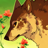
Overall, I like your work! I think you have a strong sense of color and your characters are depicted really awesomely. While you have a pretty good grasp on anatomy, some of your images fall short of that extra umph that they may have achieved from having, for example, feet that made just a little more sense. Also, I love your texutre, but you could reign it in some places.In https://www.weasyl.com/submission/227697/carvisan and https://www.weasyl.com/submission/314008/so-fab exsist the feet that make me use feet as an example, but in https://www.weasyl.com/submission/183872/commission-3 with hands and arms baring the same question. In most cases we, as artists can forgo some anatomy perfection for whatever reason we chose, but I find that when certain important body parts, like the hands and feet, there really isn't much fudge room. The keyword to keep in mind is believeability when comes to the living forms (even objects and backgrounds). In the style you are working with, which is a sort of not far off of realistic, so consistency is important. You have it in most of the main part of the body, but sometimes legs and arms get a little squished. Wehn drawings hands and feet, you don't need to be 100% accurate, just think of whether or not the form you have drawn is believable. It is difficult to image the feet in the piece "Carvisan" as being an actual form. You follow me? Just a little extra attention to anatomy would really help you push your art to the next level!
You have a really good habit to have texture in your work, and I feel like a lot of artists in the community tend to flatten out a lot of texture and go for the clean flat look that seems so popular with the furs. I love texture, so seeing it used so confidently and without apology makes me smile. That being said, I think you could reign it in a little bit. Creating focus on areas by tightening up the points you want to stand out more. In https://www.weasyl.com/submission/413213/wild-card-alicefelidae , https://www.weasyl.com/submission/198061/orbor-corpsesmith , and https://www.weasyl.com/submission/336696/wild-card-rakakuza , your application of texture is treated so uniformly that that when it comes time to decide what to focus on, I feel a little let down. I know your capable of doing it, in https://www.weasyl.com/submission/319139/wild-card-ahst (while the hair could have been just a little more concise) and https://www.weasyl.com/submission/227697/carvisan (with the use of the white lines on the head and how they are more smudgy and gray in the body, good stuff!) you do the sort of thing I'm talking about. So, I think you'd benefit from tightening up your focal points and thinking harder on where you should tone down the texture.
One of my favorite pieces from your gallery is https://www.weasyl.com/submission/233726/in-the-forest . It could use some tightening up, like I talked about before. The critters could be bolded up some, the stones they are on could be beefed up with some texture (perhaps like an overlay even) and parts of the tree that are in the same depth of field as them have some texture as well. The water could use a little work too. Remember that water is reflective, so you should try to mirror some of the darkest darks that are in the surrounding area surrounding said water. Imagine what the colors above it would be and apply those to the stream. Also, maybe you could attempt having a flow to the stream. You have those ripples going out as if it were stagnant water, but if it is a stream you should have the ripples conforming to that.
I also find https://www.weasyl.com/submission/198061/orbor-corpsesmith really fun and has a lot of potential. Again, tighten up. The critter could be more slick because he's all carapacey and have more definitive lines in the foreground. The smoke in the background, I think, might look stronger if it was more plumey and poofy instead of some odd dark streamy wiggles, research explosions and go from there, but I wouldn't say that the background needs much more beefing up, in fact the linework on the wall is a bit too much and brings it into conflict with the foreground linework. I think that when it comes to deciding which areas should be looser or tighter come to where they are in relation with one another in space. Things further back should be looser, things in the middle-ground should be the tightest, and things that are closest could be loose again. I mean you can fiddle around with that last thing to suit your needs. My main point there was to say, decide which depth of field you want to be most emphatic and tighten up that bit of businessCritique over :P Sorry for going on for so long. I haven't really stretched my critiquing muscles since I was in school, so I hope some of this was helpful and not just a wall of rabble.
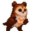
As far as things I would like see from you more; I would love to see more of your taums in full illustrations. They are such fun little guys and I think it'd be great if you worked up a series of images involving them or something!
-
-gently fawns over you- Thank you so very much to take the time to peek through my gallery to really give me this. ahh this is pure gold in its finest works -writes down things- I can see what your getting at with my works and I can agree with tons of it. There is much for me to learn indeed and since they are more pinned down I can work harder on them to make sure I can do my best
Thank you! -bows-
-
Your welcome! Glad to help :D
-
-
-

this is more of critique of general stuff. as a fellow artist, and knowing you're currently working on a portfolio for the game industry:
start collecting yourself a huge folder of real-life references of people, places, and things. dive into things you wouldn't normally research, and start figuring out why things are built the way they are. this goes for everything. everything is built a certain way for some purpose. form follows function. start getting a huge database of knowledge and research of everything you can imagine. this is building a "visual library." a visual library is incredibly important for an artist. it's the 70% of work that goes into an image. research, development, and design. make a vast visual library for yourself to reference whenever you start to design. right now, i can tell your visual library is lacking, which can stunt the flow of ideas for designs. start broadening that horizon for yourself.
take risks with your work, and don't be afraid to be daring. you have tons of cool ideas, but i can tell you restrict them. don't be afraid to throw up the first idea that comes to mind, analyze it, and assess it from there. this also comes with learning how to be patient with repetition. your first design/concept will never be the ideal one. keep going, keep exploring the design, and don't be afraid to redraw a concept over and over again until you get it right. this will also assist with your visual library.
start taking into consideration the silhouette of the character in your illustrations. make sure it reads correctly to the audience. silhouette is an incredibly important tool, i can go over that with you more in the future.
overall, you have great instincts when you design things for yourself. broadening your visual library and being even more aware of your designs will make that even stronger in that department. design is incredibly difficult to master, but you're well on your way with that! just keep pushing farther than you're at and you'll start getting your feet dirty again. <:
-
Thank you so much! all very great advice and writing it down for myself all together! I'll try to make a more personal library for sure I can't keep on just googling stuff XD or using tumblr. I do need more life study again I really gotten rusty with it. Thank you so much for pointing that out! u//wu i'll need a new pair of shoes for sure
-
-
There's so many great critiques here I'm not sure what to add that hasn't already been said. I guess keep up the good work, always experiment and try new things! Never let yourself get comfortable for too long, always push yourself to go even further.
-
FOr sure! thats one thing I fear, is getting to stale X//d Thats hwhy i'm thankfuul for those to help me out with this, in the future when i do get this fear back though you'll find this journal again X//d
-
-
From what I can see, you're quite brilliant!! I only follow people that I feel are an inspiration for me and when I saw your creatures, I felt drawn to it ^^
-
That means a lot to me -bows- I hope with my future art i'll continue to draw your attention into new depths of magic!
-
I believe you shall!! And I hope that I can post art that people will begin to love or like at least. ^^
I have artwork on other websites but I feel like I want to start fresh here =D
-
-
-
I'm not very good with giving critique. I'm not as knowledgeable as I'd like to be.
You seem to have a firm grasp on color as well as the style used with it, it's actually my favorite trait of your art.
I believe it'd benefit from some contrast though, maybe darker color choices for some more intense shadowing?
This would help especially with your humans. They have a tendency to look flatter than your other pieces, and would benefit from some contrast. More indepth shading may help too.While I don't mind the lineless style( I actually quite enjoy it) I do think it'd be beneficial to mess around with inking. Maybe some solely inked pieces, just as practice, nothing you have to share. It'd just be a good skill even if it's a challenge.
I don't know if this'll help, it's not as detailed as some of the others.
I hope it gives you some ideas none the less.
-
Ahahah i'm in the same boat I wouldn't be exactly able to put alot of things i find with an artists, only tell them of the stuff i like X//d.
Contrasts I do have a tough time with sometimes Its hard when some color combos dislink it. And my humans X//d aahhh those are embarrasing cause they are definately too cartoonish. I would probably have to work more on my shading for them for sure.THank you so much! i'll.. give it a try X//d! Thats all i can do! it'll definatley get me some new techniques for sure if i can manage it!
-
I just don't know enough of the technicalities to give a nice rounded crit. I try to give the critiques that I'd like to get.
I also worry about being too blunt :IContrast seems to be something a lot of folks struggle with, myself included.
They definitely are more toony than your other stuff but not to the point it's obtrusive.
Which is why I didn't mention it, though I debated it.It'd definitely be beneficial to work the style of them, especially if you plan on doing a comic with humans.
If it causes physical discomfort, then you don't have too, I don't want you to feel forced by any of this D:. It's just a suggestion if you want to experiment.
-
ahhahah thank you .//w. and -nods- for sure with the comics ordeal!
-
-
-
-

Hnnggg I'd have to say im not the best at critiques and I really really love your art tons <3 I have to say though I think your art would pop more if you added a bit more contrast and with pictures with foreground and background you could maybe look the background look more distant if that makes sense? Like adding in more darkness/lightness in the background depending on the picture. I think mostly you shouldn't be afraid to go dark in a picture :3 I think it could really improve your artwork!! Lastly, I think, you should maybe try different textures in pieces and don't be afraid to try doing variety of textures all throughout one picture (tho i really love the brushes you use now!!)
Ultimately what I love about your art is your style and how beautiful your colors are!!! They're by far one of the best color mixtures I've seen artist use and you definitely know how to make some tasty palettes /weeps/ TwT
-
I like the style you draw. You seem to be an overall pretty nice person, and you're talkactive - which is rare and very appreciated. BUT. We're friends here and I never got a cookie. There. I said it. No cookies! That's a shame. noms muffins alone
-
OH GOSH WHAT CAN I DO TO MAKE IT UP TO YOU!? YOU WANT A CAKE INSTEAD I KNOW THE RECIPE -minecraft-
-
CAKE! IT SHALL BE CAKE THEN! (I still have muffins, we can nom on those while we wait for cake, though. <3)
-
what kind of muffins, i really like those banana nut kinds.
-
Chocolate. Simple chocolate, BUT I got them for my birthday so they are THE BEST™. And I'll make you some chocolate milk. Chocolate heaven, here we come! ~fly's off to chocolate heaven
-
-
-
-
-

Well I love your colors and the softness to your art. And I see others already mentioned what Ive seen and would suggest work on. (mainly for your higher priced things.) Background can be soft and all that but what might help with subjects blending in to it try to make the very outside of edge of the subject a little clearer then the rest of the subject can be soft because thats your style and it looks great. If I were to commission you i could care less if my subject blended into the background cause I love the softness of your style it makes me smile.
SECONDLY, Its just a personal want and curiousity. I would like to see a few more personal pieces that you've made for no one in particular and preferably with that Taum fierceness!! I'd love to see some angry taums ^_^
-
oh gosh! i would definately like to fulfill that wish then to see more taum fiercness!! thank you so much about the info and i'll do my best u//wu.
-
-
As a future costumer... I can't wait to have enough money to commission a few things from you! I like your style and colors, as well as how you do your art. I'm looking forward to being able to work with you.
-
I'm looking forward to it as well! Ahhh! It makes me excited! I wonder what Kind of artwork I'll be doing for you! u////u thank you so much!
-
-

Maybe this will be of no use, but let me tell you.... your art is amazing. I mean, the colors you choose are so perfects ! Not too flashy, not too fade. And your painting style is awesome too. I dont know what to say more !
Link
insanejoker
I can't think of anything. I love your use of color and style. :)