Sign In
Close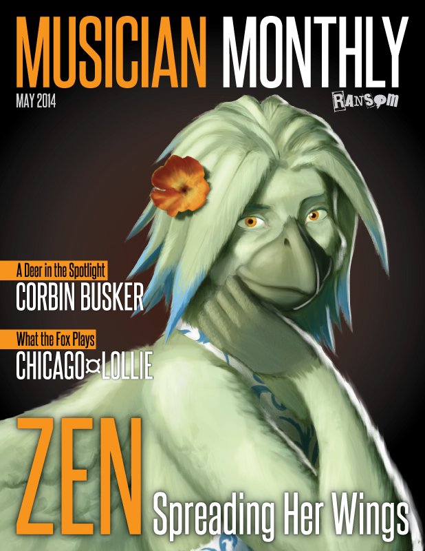
Title cleverly supplied by Dee.
Adri's alternative title: Zen's Got Issues.
Right on the cover? Zen's getting some recognition! Also check out this month's issue for featured articles on the musical stylings of the Fox and
the Deer.
—————
Did you know that I have an education in graphic design? When I'm not drawing furries, that's typically what I'm making. It's a style that doesn't cross over into my furry work very much, which seems like a waste of talent. I also love drawing Zen, but I don't do it nearly enough. This magazine cover is an attempt to remedy both!
This file is made with both vector and high-rez raster imagery, and actually has a bleed, so it could be printed to be a real cover. Additionally, I used this as practice and a warm-up for digital painting. I got some chalk, charcoal, and oil paint brushes in Photoshop, and tried them all here. I like the result.
Created in Photoshop and Illustrator.
Submission Information
- Views:
- 896
- Comments:
- 10
- Favorites:
- 17
- Rating:
- General
- Category:
- Visual / Digital
Comments
-
-
Haha, that's flattering! It's always neat to win over people who aren't really into birds or micros with Zen. Thanks!
-
-
Nice lighting on this one. It does convey the whole "studio photography" vibe very well.
-
Nice work here - the only issues that I can really find is with the layout and spacing of the text between "ZEN" with the text above it, the slight lazy-eye going on due to the different lighting conditions in combination with the perspective, and finally, the upper-arm which has a slight bend to it (ie: possible anatomy issue/unrealistically curved forearm structure).
Other than that, it's damn good work overall!
-
The leading between "Chicago Lollie" and "Zen" conforms to a grid. It's the spacing further above, only doubled, allowing a little more breathing room between the secondary headlines and the main headline.
Regarding the lighting of her eyes, I did want to include the shine in her right eye, the same as her left, but I imagined it should have been obscured by the shadow of her bangs. That's why only the left has the white dot. Perhaps I miscalculated -- the lighting was done from imagination on this one.
Admittedly, there may be anatomy problems. While I did use a reference, it was quick -- not a meticulous study. I've always got room for improvement there.
I am glad that you like the drawing, regardless, and I appreciate the input!
-
-
This is a pretty cool cover.
-
Thanks! I'm glad that you like it.
-
-

I'm just sort of beginning to get into graphic design, so it tickles a bit to see other folk's work in this area. I The the color choices are great. Either way I wonder if any of the text would look nice if its color changed to a direct complement of the figure's green feathers. As it is, the orangey-yellow contrasts plenty and so it's both legible and readable, and it works.
What was your rationale behind that color choice?
-
Thanks very much! The reason I chose orange is simply that it matches her eyes. The brown background also helps bring them out.
Otherwise, the compliment of her cool green feathers would be a warm red. However, I often like to work with limited gamuts.
-
Now that you mention it I do see that the orange did come from her eyes. I think that's a really good decision, and probably why it works.
Thanks for sharing~
-
-
Link
Aluminum Foil
Awe, this is actually cute c: ~ Normally I'm not so much into the avian types but this is pretty nift indeed.