Sign In
Close"Break Time" WiP 4: Establishing Gradients & Colors by Sparkyopteryx

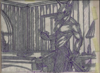
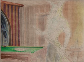

I mentioned on the 3rd one that I'd be skipping a step, which would have been showing the bare bones transfer on the paper before I started to color, for those of you wondering. Anyway, this here is where I start to "plot out" the base color scheme, lighting and gradients using dusting from chalk pastels. How I achieve this is by scraping the chalk stick using my Xacto-knife (seriously, this tool is one of my most versatile and well-used weapons in my arsenal. Said weapon also doubles as a weapon. Stab stab stab!). The resulting shavings are then "painted" onto the paper using my old paintbrushes. That is what creates the soft effect.
As I mentioned, I'm doing this simply to establish the most important base colors and to see how my lighting will look. Naturally a lot of blue and orange were used; blue for the areas I want to recede where the light is farthest, and orange for the areas near the lamplight that I want to bring out. Blue is also going to be utilized to create a second highlight around Foley, which you can see the start of here. I did not focus on exacting detail or even pay that much attention to the lines under the pastels; that is where the colored pencil will come in instead. Soon I will start to get finicky, but not during this stage. I fixed that though since then.
Next step: Spray it down with workable fixative and begin coloring with colored pencils, starting at far left of piece and working right.
Submission Information
- Views:
- 280
- Comments:
- 0
- Favorites:
- 0
- Rating:
- General
- Category:
- Visual / Sketch