Sign In
Closeany of u weenies wanna do a quick trade by Dogmeat
i havent done trades in a while, but i feel like doing something quick tonight!
anyone up for something sketchy and maybe flatcolored (coming from my end i mean)??? hmu with some refs here and i'll poke around!
i got these dinguses up if you'd like to take a crack at 'em 'u'
Mel
(clothed) (nude ref mostly for bodytype ref aa)
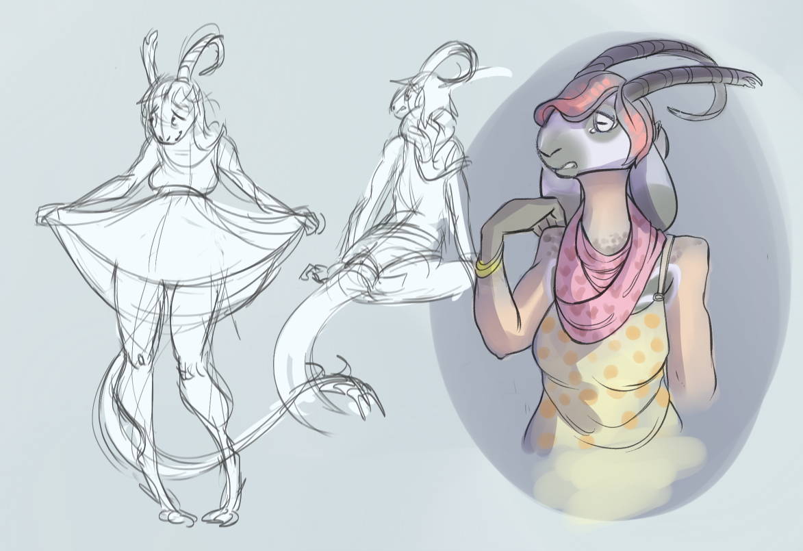
lucy
(dumb mutt)
i have other babies but!!! i dont show them much and mel is very new haha pff ;u; i figure these would be the most 'pleasent' to draw u know??? ahh
Journal Information
- Views:
- 194
- Comments:
- 9
- Favorites:
- 0
- Rating:
- General
Comments
-

-

aw heckye i'd like to take a shot at your character 'u' you can totally pick from whomever i have listed up there, so whoever strikes your fancy yanno?
i'll start my end tonight after dinner! uvu
-
https://www.weasyl.com/submission/600896
Eeep, mines done, I hope you like it, tell me if there's something I need to change? I unfortunately miscalculated the space on the paper and couldn't do her ears larger! ;w;
-
-
-

I've thought about doing more trades, but the latest one I've done has me back at the lab working how to make digital art that doesn't end in the over-saturation effect I'm getting. (I think I need more opaque paint, and less glaze layers)
-
it sounds like you're thinking about the process in paint layering, which is actually a pretty good way to start! A good method of bringing in your colors together would be to choose a set you'd like to use, and then add an Overlay layer in photoshop with an overall harmonizing color (like say purple or blue for instance). sliding that around with the Hue and Saturation tends to help bring things together and sometimes produce more muted color palettes c:
my bf's a lot better at choosing more desaturated colors, his name on here is home if you'd like to take a look! i'm still on the brighter end in comparison haha
if you'd like to take a look at someone who's in the pro field who really treats his digital mediums like paints, try looking up GoodBrush. their stuff is absolutely amazing
-
That is really helpful, The thought of using a colour picker did cross my mind (Such as this: http://colorschemedesigner.com/ ) which would've spared me mixing my own palette and have an easier time keeping the same values. But then the wisdom of 'The Bird's Pink, the Martian earth is Red and the Sky is Green' took over and things got muddled fast. When I first watched the tutorial video I was following I was wondering why Matt Kohr (Ctrlpaint) had made the image so dark, which was to avoid the oversaturation. (I didn't watch the series all the way through, but just dive in as soon as I had an idea.)
Also is that Home? As in https://www.weasyl.com/~home ? I'm kinda a really intense fan of his art that depicts more environmental details (Something I want to do more of personally, as well as wish the fandom took more seriously as I'd love to see more of: http://www.fengzhudesign.com/index.html not to this level of detail, but the fanastical or modern urban environments. o3o )
I'm not familiar with Goodbrush but did take a look at the quick tour. Similar to Feng Zhu, I'm really interested in how digital artists acquire that mixed media or 'traditional' look, yet after reading about it in magazines I subscribe to, at the moment it's just trying it for myself, of which you've been helpful with, now that I have one problem nearly solved.
-
whoops i replied to you down there, sorry about that!
-
-
-
-
ohhhh i think ive heard of matt kohr before! i havent seen his videos personally but i've seen his stuff floating around 'u'
ayep! thats my dumb bird boyfriend haha. ohyeah dude, thats def what he does uvu a lot of the work he does comes from compiled reference, and a lot of uhhh whats it called. that impressionist look, in that his stuff is detailed but not precisely yanno what im saying??
OHHHHHH dude thats a LOT of matte painting! c: a lot of those images are painted over photo composites (not all of them though but quite a few are). Its the quickest way to do concept art in the industry rn and has a nice rough look
yeahhhh i know what you mean haha. ;u; its just something that comes in parts; its a lot of painting knowledge and experience, a little bit of brushes, etc. just keep practicing and dont hold back yanno?
i know im still dicking around myself ;v;
-
I really like Matt Kohr as it was his 101 Digital Painting videos that actually explained on-screen mixing in a way I could understand, and his videos are far cheaper than what I've seen elsewhere. (I BUY EVERYTHING FROM HIM) Speaking of dicking around I'm still doing character design, and even more being hard about it. I Had a run in with a friend who isn't the most design savy as they're starting out and I asked them how many times they drew a character till they were happy; twenty (Unexpectedly high, although I know iterations are important they shouldn't be time consuming either.) then asked on average; Still they said twenty but only for the protagonist and others they got right 'on the first sketch'.
At that point I immediately understood the phrase 'Kill your darlings'. I never would've never anticipated the gains from a vocational art course prior to taking, but it's helped massively with planning any design work.
I also did suspect the images were painted over but I haven't seen a specific tutorial of him doing it yet - I limit my watching time so I can reflect on lessons before moving on so I only watch one a week. But it makes sense in that with an on-demand job and pressure to produce something to get others to quickly work on realizing a concept you need to work fast, and working from scratch isn't always the best when you also need to worry about form, scale and perspective, in addition to all the standard worries.
-
Link
Reisfuchs
Oh, I'd love to do a trade... will throw my stuff here:
https://www.weasyl.com/submission/335936/prepared
Her names G11, arctic fox, no markings, few notes tho:
I deperately need to do a proper ref D: