Sign In
Close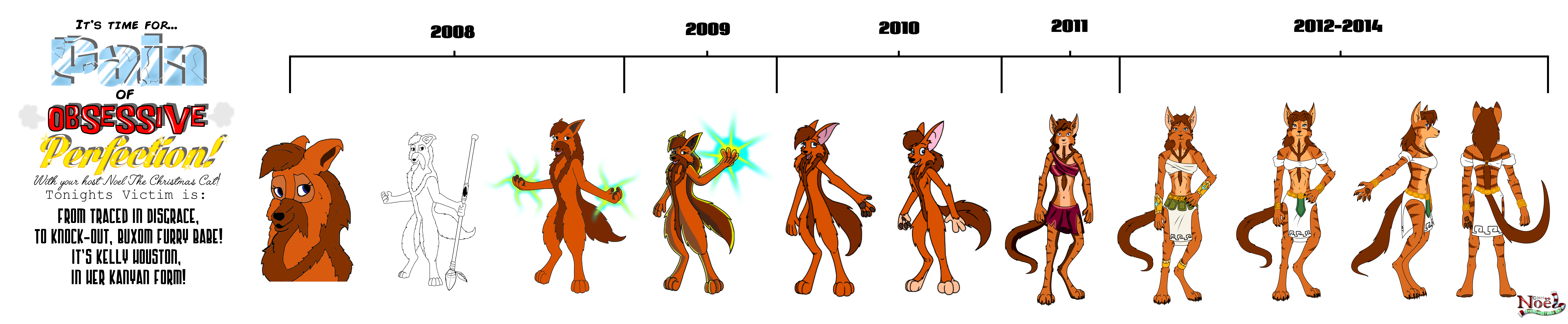

Hello boys and girls, and maybe this time husky’s and vixens! Prepare for another wave of cringe-worthy puns (and I guess that counts as one) cause it’s time for…
“PAAAAAIIIIN OF OBSESSIVE PERFECTION!”
now with it's very own, totally original theme song!
Yeasssss, our humble little show is just getting off the ground, but we welcome you back to the fray. I’m you’re host Noel the Christmas Cat, and lets get POOPing! So, what exactly is POOPing again? The basic jist of it is that “Pain Of Obsessive Perfection”, more commonly known as POOP, is a condition that some artists fall into in which they expand their skills a little quicker then they expand their workbase. For whatever reason, (usually perfection based) they fall into a habit of reduxing old work when their standards rise, rather then moving forward immediately. This can lead to big delays, and/or mountains of hashed material. And if it happens repeatedly (as it did for me) I like to refer to it as a “Poop Loop!”
I think we can all agree a pretty bad habit to fall into. There’s only two ways out (well, technically a third if you consider quitting, but that’s a path I can’t comment on!) : It’s something you either wanna find a satisfying niche and get out of fast as possible, or hang back until you’re dead certain you’re happy with the POOP’s you’re taking. There’s nothing worse then settling on a style and technique, only to have excessive POOPing syndrome later and wanting to expand! It can be such a strain! :3
In my case I unfortunately took that latter path. Not exactly by choice I’ll admit, but I was a much slower learner then I thought. And we’re gonna get another demonstration today. Oh, I’d like to point out that despite me using characters specifically for my POOP examples, this could apply to anything really, if it’s gone through a similar polishing process. Comics, landscapes, even music counts! There’s not a whole lot of polish on my end besides characters, but a F***-Tonne of it nonetheless!
Anyway, enough delays! Lets get to the POOPfest! Our contestant today returns from last times show, but she’s had a rather hair raising change since then! Put your paws together for the return of Kelly Houston!
Today’s Victim: Kelly Houston (Kanyan Form)!
2008 PERIOD
Well, what a spot I find myself in. you’re not just looking at the first picture of Kelly I drew there, but the very first image I ever drew digitally! Yep, good ole gimp 2.4 at work there. Just as reliable and trustworthy a program as it’s modern counterpart 2.8… cept for the tool restrictions… and the power restrictions… and the lack of support… and the sudden, still to this day inexplicable crashing that COST ME HOURS OF WORK ON A RAINY DAY, AND MADE ME TERRIFIED IF I DIDN’T RESET THE PROGRAM EVERY FIVE MINUTES!!!... ah, good times, good times.
“Traced in disgrace” unfortunately, isn’t there just to have a rhyming pun. This actually came from a frame of Cindy in the webcomic “Faux Pas”, which I was a huge fan of at the time. (How I hid being a furry as long as I did is beyond me, with characters like Dusk and Cindy plastered all over my hard drives.) It’s Disney-ish look is a superb example of the kind of style I’ve wanted to learn since I was a kid, and before then had never really been able to freehand. Instead, always finding frames from Disney movies or the like and tracing in much the same way. It was a bad habit I wanted to drop, but sadly employed here for my lack of skill.
This was a period where I went off scans as bases too, so the trace was on paper; I would literally put it up to my monitor, bring up the comic clip to the right size, and trace as desired! Then scan back in and traced again. It was incredibly tedious and no way to improve, unfortunately. That said, for my very first attempt at mimicking a style digitally, this actually isn’t that bad! I don’t feel as bad about this one as I did for human Kelly’s debut. Given how I draw now it looks like a relic, but it’s pretty well polished given the time period and my methods.
Alright, seriously enough rambling about that one picture. The other two were the first full body shots on paper and these thankfully weren’t traced. But they weren’t particularly good as a result either. Anatomy looked more doglike in the originals as you can see. That’s what a total lack of understanding even the basics will get you. I was literally winging poses here, and they looked too plain. I don’t have a colour of the first to compare; I think I lost it on an old hard drive a long time ago. But I imagine it would’ve looked a lot like the first two. Shading was still foreign to me at that point… Oh wait, I remember I used a cartoon shader built into GIMP to try and get the same effect with 0% effort! Yeah… I can’t ever recommend that.
Well, this was a mouthful. We aren’t even close to 2014 yet!
2009 PERIOD
So the 2009 Kanyan Kelly got a bit more effort put into her then the human one. Funny, I guess some things never change. The work shrunk in resolution, much like I described last time. Only here, I felt kind of power-tripped by getting the hang of the shading and backlighting, and considered it redundant if I could make it flashy enough. A literal example of rolling a turd in glitter, here.
2010 PERIOD
A slightly better understanding of anatomy here, I think. As you can see (most likely cause of the different leg types) The Kanyans didn’t end up quite as Bayonetta as the human characters. No, they just got super long arms like gorillas! Measuring that shit out was a pain at the time. So few sensibilities that I now have are in action here, and it’s pain to look at cause of it.
The other came in that whole cartoony period. I’ve remembered something since last time too: That came consciously as an attempt to dumb down some of the harsher elements and make Kanya more accessible. As a kid, no matter the actual story, I would gravitate to something if it was animated, and it seemed like most other people would too. That whole Disney look and formula was very eye catching and engaging, and I wanted to create a similar thing, then surprise with a very adult-oriented story. But the dumbing down thing (and I use that without hesitation, cause that’s what it truly was in my case) never felt comfortable. It was… short lived, honestly. I think it was about the time I was designing Odie that I decided to drop it completely. Can’t exactly market something as kid friendly when you have a rabid, murderous, blood-soaked kitsune running around with the main heroine.
It’s something I’ve revisited occasionally out of pure curiosity, and you will see little traces of that show up from me eventually. But would I ever consider revising this style for Kanya legitimately? No, I don’t think so. The more adult and realistic my style’s become, the happier I’ve been.
2011 PERIOD
Not the best example of that here, however. This was the transition point. The DPI res got bigger, the lineart got more skilled, and I really buckled down on anatomy. Again… Kanyan Kelly fared way better then Human in this regard. Unlike human however, this didn’t get a second design that year. This stuck until early 2012 as her design, but unfortunately I never got any legit pictures done with this style. Perhaps that should’ve tipped me off not to get comfortable so quickly.
Okay, no more putting off, time for the elephant in the room… YES, THE KANYANS DIDN’T HAVE CLOTHES FOR A LOOOONG TIME! And it was planned guys, I really did from second one, but in those old styles (especially the 2008 ones) nothing I tried ever worked. The few times I did try clothes they were embarrassing, more examples of that downwind. Kelly at one stage even ended up getting a bit of a Mayan-warrior princess look to her, with gold armour and feathered headdress! (I don’t know if I have any surviving pics of that, I’ll have to check again.) It honestly didn’t fit her character. I wanted something more casual, something that looked as if Kelly hadn’t given her look too much thought, but also still feel distinctly Aztec. This kind of outfit and colour scheme… not only did it look TOO plain, but it clashed. The red tint blended with her fur colour and didn’t stand out at all. And most importantly, this didn’t exactly scream Aztec. This… almost looks like lingerie!...
I’m a furry, so I can’t and won’t defend myself. Maybe I had a few too many late nights when I came up with this. Wouldn’t surprise me.
2012-2014
That first one was very nearly a serious contender for her “final design”. At the time, very happy. Very content. It looked casual enough and it had an Aztec feel. Some of this was an upgrade of that earlier armour actually, but the less of it incorporated, to the point where it was more like jewellery then armour, seemed like a better route. The human form one existed at this point, but I don’t think I had the Aerith bangs yet, hence the slight difference in hair styles here. But once again, good contender.
The second one was an attempt to streamline it a bit and change the hair to match. That, by the way, worked out better in the Kanyan forms case, I think! It seemed to really pop and make Kelly’s face stand out a bit more. Once again, the less armour she had, the more I liked it. I made the decision to cut those greaves, much as I liked their design. The more she started to look like a priestess then a warrior or a citizen, the more satisfied I was. This did ultimately become the final design. But – I was very iffy on it for a long time. I was worried it was starting to look a bit too anime; those shoulder tassels looks like something Noel Vermillion would wear. In fact, the whole thing does a bit. There was a danger there of misleading the audience. Kelly is NOT THAT kind of character, and I didn’t want people to think she was.
However, the reason it stuck and ultimately became the final one was that the more I used it, the more it did bring identity to the character. It became quite a unique look that made her stand out against the rest of the cast. Also it was more appealing to look at then it’s predecessor and quite fun and easy to draw too! I got the hang of what may have otherwise annoyed me about it very quickly, so before I knew it, I decided to declare it the final look.
However, someone wouldn’t be on my POOP show for no reason. Quite a big, critical change for not just her, but EVERY Kanyan character came along in the first month or so of 2015. Far more jarring a juxtaposition then the human versions of her – here, finally, is a glimpse of the truly re-imagined Kanyan Kelly to take us out:
Thanks for sticking with me if you read this far. I’d like to know what peoples thoughts on POOP as my little side project so far are, and I hope I’m keeping it enjoyable. Maybe even inspire other to look back on their own work in the same way and draw awareness. Trust me boys and girls, you don’t want to watch your life fly by like I did. If you’re POOPing, you need to take a long, hard look at that POOP. and decide if it’s benefiting you. Should you push it out? Or close the lid on that experience for another time? Make the choice now before you end up… well, like me. Neck deep in da POOP and wondering how you got there!
This is Noel The Christmas Cat! See you next time.
Submission Information
- Views:
- 594
- Comments:
- 0
- Favorites:
- 1
- Rating:
- General
- Category:
- Visual / Digital