Sign In
CloseSilvanus - Request for PixelHoot by Moved Accounts... (critique requested)
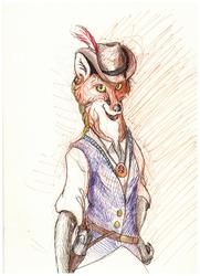
A portrait of 's character Silvanus, done as a request from this here: https://www.weasyl.com/journal/85954/doing-requests-just-so-ya-know
Also served as another real attempt at using colored pencils! Not something I'm super familiar with, but I'm liking them so far.
Done with Prismacolor colored pencils, Verithin pencils, and felt-tip pens.
Submission Information
- Views:
- 556
- Comments:
- 5
- Favorites:
- 1
- Rating:
- General
- Category:
- Visual / Traditional
Comments
-
-

That does seem to be a common issue with a lot of my work - the angles just don't align where they should, and the drawing ends up with a wonky sense of perspective and form. It's nice that you were able to point out a few instances where such an issue could have been resolved, so I'll be sure to keep your feedback in mind when I'm working on your own request.
I usually strive to portray characters realistically, and though this was a personal interpretation of a very stylized character, I'm inclined to think the large head, etc. were either an error on my part. I want to get a good grasp on perspective, anatomy, form, and structure so that I can accomplish this, and if something doesn't look "right", I'm always happy to hear about how I could improve it.
Thank you for your critique!
-
-
Ahh this is so lovely! I love it, thank you so so much! You did a great job with him and I'm really glad you had fun drawing this. ^v^
As for the critique, I can agree with the stuff DraconicTreasure said. I think the part of the beak that's throwing off the angles is just the lower part. I think if it wasn't showing as much of the inside of the mouth it would line up better with the head. I don't actually see a huge issue with the watering can but I do think it would have a better form if the bottom wasn't as curved/deep. The neck could stand to be a bit shorter, but that could just be your style. The way you drew it makes it look more realistic and bird-like even though it's quite longer than a human neck. The leaf on his head could probably be moved back so that it's at the top of his head; right now it's sort of at the top of his forehead but it looks like the top since his head is tilted back. The only other thing I can see is that proportionally the arms might be slightly too short, but it's hard to tell without the legs in the picture. Overall though I can't find much wrong with it, so sorry if my critique's lacking.
-
It's all good. I appreciate your honest feedback, and will make sure to consider your advice in the future.
Man, that beak was driving m crazy, though. I noticed the weird angle only after I had inked it, and was trying so hard to make it look a little better. Seems like I could stand to work on proper form and perspective some more; it's usually pointed out that something in my work looks a tad Escher-esque by accident. Necks are another issue for me. Most of the animal characters I draw have proportionally long necks because it looks strange to me if their necks are closer to human in proportion, but I have yet to find a good balance there. Maybe it's just preference. I dunno.
-
Having beaks/muzzles (and other body parts) at weird angles is something I see a lot of artists struggle with. That kind of stuff and perspective are pretty difficult to get a good hang of. I guess the best thing to do is use references and practice a lot. I think the way you draw necks works well, it's just different than what most other artists do so it stood out at first, but that makes it a unique part of your artwork.
-
-
Link
DraconicTreasure
Heee. 'S cute! I like the way you've blended your selection of physical media together. It's neat, and gives a wonderful texture to the image. I adore the sundial watch! Also, the detail of the holes in the watering can're a nice touch.
From a critical stand point, the watering can seems a bit.. Off, perhaps? The bottom most curve of it doesn't seem to flow properly with the shape of that kind of a watering can, where it blends into his hand, when combined with the way that his glove is holding onto the neck of it. I'm having a difficult time placing exactly how to describe what looks off, but the angles just.. don't quite seem to match the way my brain is trying to put it into a physical space. At a quick glance, it conveys what it should be, but it is pushed into the uncanny valley for shape compared to the rest of the image.
The head and beak and reasonably well done as far as the proportional size to one another, though compared to the rest of the body, it seems just a touch large. That's not a bad thing considering the style of the character, and when one takes foreshortening into account, it seems fitting, though the foreshortening doesn't seem to follow through on all of the image, so it'd be difficult to use that as a reasoning for the relative sizes. That said, it also could very well be a matter of design of the character.
Otherwise, the only other thing I can see is that the angle of the beak does not sit properly with the angle of the face / head. If you look along the back side of the beak, it jumps up, and would connect half way up the beak itself, rather than at the back section of the beak where the joint is. The shape and form of the beak itself is great! As is the shape and form of the head. The issue is just the angle of the two when combined; it looks like they're connected at a 30-45 degree angle from one another, as if two separate references were used, taken from images at different angles from one another. Again, by themselves, they're very well done, it's just a matter of when they're brought together that they have a jarring, misaligned effect.
Otherwise, it really is a rather adorable picture. The leaf on the head adds to the cuteness quite a bit. I hope the above comments prove useful, though I wish I could better offer suggestions on how to fix things.