Sign In
Close
Well, first post to this gallery site. I can say I do enjoy the interface a great lot. It's a really nice site and I'm impatient to start fiddling with the folders feature.
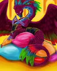
Now, for now I was thinking of making a "portfolio" account with this one. As such, this picture is one of my most recent that I feels worthy of a portfolio. Do feel free to critique, however, as I'm always willing to try to improve!
Submission Information
- Views:
- 439
- Comments:
- 5
- Favorites:
- 5
- Rating:
- General
- Category:
- Visual / Digital
Comments
-

-

There were never any real reasons behind it. Perhaps it was just my mood at the time ^^
I keep telling myself I should try to make art with a warmer palette again though. It often feels lot of my better pieces seemed to be done when I was working with such colors.-
Warm color palette has it's great moments.
BTW: Have you, ever thought or tried or thought of trying to use the so called familypalette? I think you might have real fun with it. The family of red, the family of blue and the family of yellow. great fun!-
No, I don't think I've ever tried! I'll need to look into that ^^
-
-
-
Also, thank you so much for taking the time to comment this!
This was always one of my favorite pieces, so I'm happy to see it is liked by others. :)
-
Link
EvilGrinn
I really adore this one! The design is smooth and the colors palette is narrow but looking very good (just the way I like it)! I noticed you've had this red phase in your older work such as this. Any particular reason and might that come back at some point? Just curious, after starting to learn colors myself. :)