Sign In
Close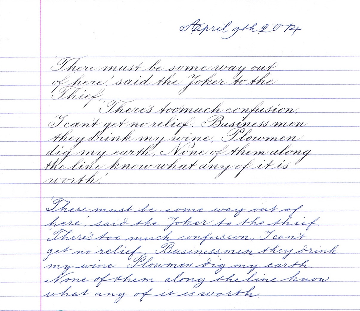


This is what my handwriting currently looks like with fine and flexible dip pen above, and a medium Bic ballpoint below.
It is too closely written, or a little to large, with the dip pen I think (see how the ascenders and descenders clash), but at least it is an example. I am reasonably pleased with the stems of the capitals since they are compound curves and the shading is heaviest in the middle and tapers as it should. Thicks and thins in the right places and the shades not dragged round too much at the heads and tails of the letters.
Another step on the road of progress and all that.
Submission Information
- Views:
- 155
- Comments:
- 4
- Favorites:
- 2
- Rating:
- General
- Category:
- Visual / Traditional


Link
Gravewalker
Goodness, this is beautiful!