Sign In
Close

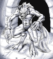
Just something that popped into my head.
Comments and critiques are always welcome!
Submission Information
- Views:
- 373
- Comments:
- 6
- Favorites:
- 7
- Rating:
- General
- Category:
- Visual / Digital
Comments
-
-

Thanks! I actually had some help from people on the forums for some of the feet perspective.
-
-

AMAZING shading! The only thing that seems off in this entire image is the bottom of the bars on the far right of the image seem like they are just erased off and weren't replaced/fixed. Consequently this also throws off your shading there a bit. As well as the corner where the top step meets the back wall.
For a fun idea, have you thought about adding layers of textures to overlay your image to give it a bit more pop?
-
Thank you! I have thought about adding textures, but I tend to forget it. I kinda get trigger happy when I'm nearing the end of a picture ^_^;
-
-

Love the dynamic in this piece. Great work ;)
-
Thank you!
-
Link
safyia
Very nice~ you can feel the sense of motion in this image~ Really good anatomy, also- I mean the proportions are excellent~ I still have trouble with that~