Sign In
ClosePhotoshop, InDesign, and Clip Studio Paint/Manga Studio 5, 2014
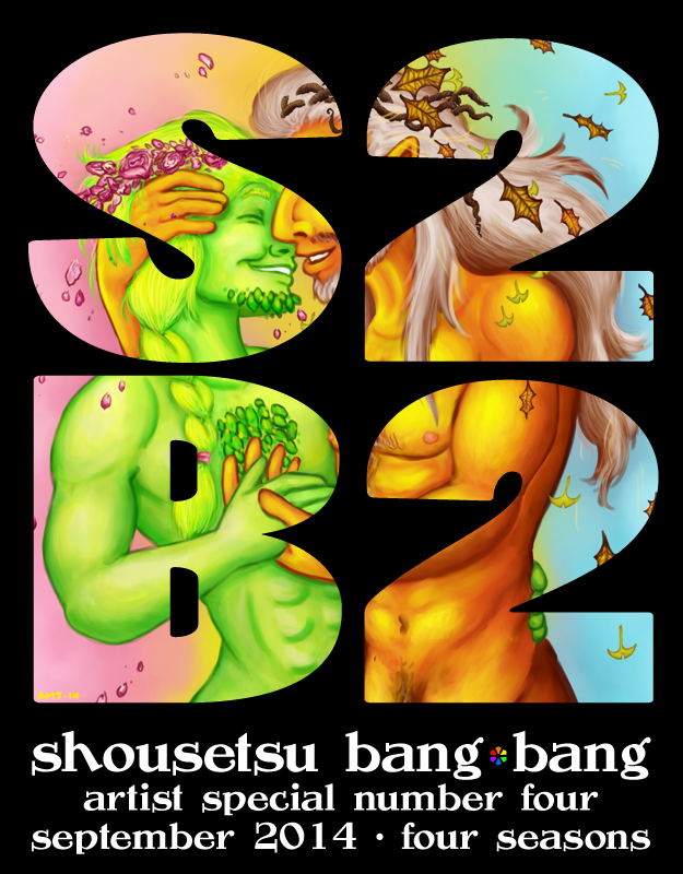
I did the most recent Shousetsu Bang*Bang cover, hooray! This is the cover version; you can find the version with dicks out in my NSFW folder. If you read that one already, most of the info here is identical! Save yourself some time!
This took a while before I knew what I wanted to do with it! I created twenty-five different thumbnails, each trying to take a vastly different approach towards anything having to do with “Four Seasons,” “Homoeroticism,” and/or “Art.” I also tried to go for lettering-heavy designs whenever possible. After stewing over my thumbs and communicating with the editors a bit, I put together three composite concept sketches using what I felt were the strongest, most thematically appropriate ideas, and it wasn’t until the second one of those that I was able to think of where I wanted to actually take the finished thing. Lucky for my my editors agreed that the sketch I liked was the one best suited for cover work!
Actually painting was an exercise in forcing myself to pick one brush (of varying sizes) and stick with it. Save for some came-with-the-software watercolor work for the background colors, I laid down the flat images with an unaliased marker tool before going over things over the course of many, many hours with a Frenden Photoshop Round More Opaque brush. If this is Greek to the reader, a summary: it’s a good pressure-sensitive tool that blends with itself well and was recommended by a friend of mine who’s been doing digital art for a whole lot longer than me. Can’t say I’m displeased with the results.
There are a LOT of layers in the final version, some which are subtle color adjustments and others which are as major as covering each character’s hair. I’m still technically learning digital painting (some of my first attempts can be seen illustrating Beyond the Sea), so a lot of learning experiences went into getting this done. The more I worked the further things got from the reference photo.
I considered having some hand-lettering for the title graphics, and even put together some brush pen attempts for it, but decided against it; the crisp vector letterforms worked better with the more organic digital painting.
As for why I went with spring and autumn? Autumn has lots of brilliant oranges and reds and golds to play with in its seasonal palette, plus some good, solid browns, and they felt like they’d contrast best with the bright pinks and greens of spring. Fall is also my favorite season, so there’s that, too.
Tagged this Moderate since you can pretty blatantly see pubes on the guy on the right, and let's be honest, they're blatantly naked under that title graphic.
I also think they turned out pretty darn cute.
Submission Information
- Views:
- 243
- Comments:
- 0
- Favorites:
- 0
- Rating:
- General
- Category:
- Visual / Digital


