Sign In
Close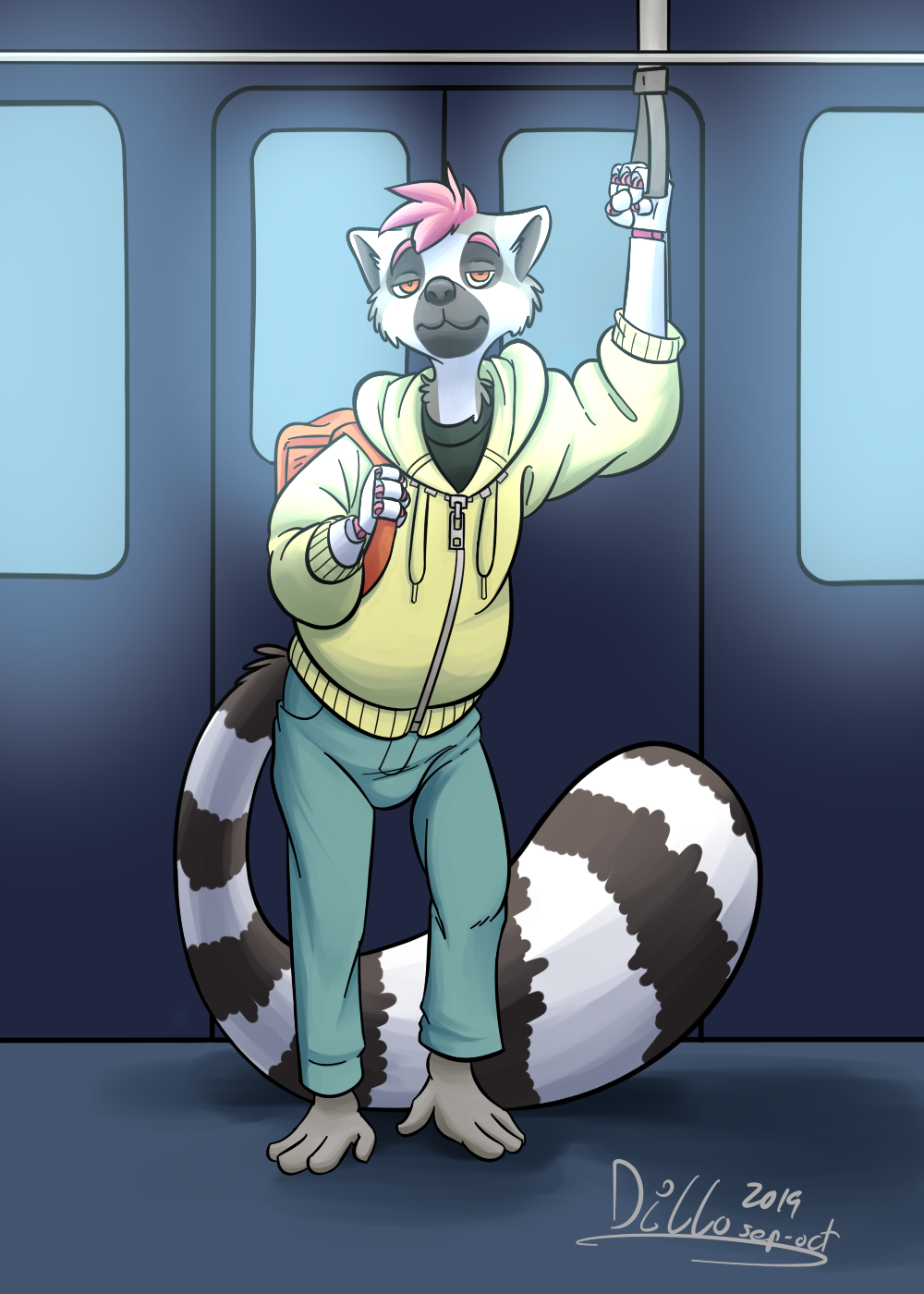

A digitized sketch of lemur boy (who might still need a name) being extra-bored on the metro. The metro's pretty cool, but when you gotta stay on it for 2 hours a day, it starts to lose its appeal.
I was mostly looking to get decent colours and contrast here; it remains one of my weak points and I really want to improve on it. Let me know if I did alright, and/or how I can get better!
The sketch and lineart versions of this image are available on Patreon! I'll be going over a few Patreon sketches digitally in the near-ish future; the digital versions will be made available to everyone, but if you'd like a sneak peek at all my other sketches, feel free to drop by!
Submission Information
- Views:
- 356
- Comments:
- 3
- Favorites:
- 2
- Rating:
- General
- Category:
- Visual / Digital
Comments
-

-

Thank you for your input!
I had thought of including a halo effect, but decided to let it go by the end, since I wasn't sure how to handle the two light sources. What you're suggesting sounds like it'd work, though; I might just try and edit it some to get that effect!I'd heard of the greyscale trick before, yeah; I checked the drawing a few times with it just to make sure I was on the right track. As far as colour theory, I'd always struggled with it despite reading about it for a while now, but that's because saturation was never explained properly! I did end up figuring it out, though, hahah.
-
-

I love this.
Link
SumiInk
The shading in itself shows one of the larger light sources, that being the lights on the ceiling, very well. However, with how bright the windows are made, there'll be a second a light source from the back. This would be show by the outline of him being brighter with the rest being darker. Since the source is higher up the intensity of the light would lessen as you get closer to the legs. This would make a slight halo effect.
Contrast is primarily caused by colors and the intensity of the shading. In this case, it's handled very well. the character's brighter and warmer colors helps him standout from the darker and colder background. Whenever contrast gives you trouble, I recommend making it greyscale if possible. It'll help you see the piece without any pops of color by saturation or hue. Looking into color theory should help out also if you haven't done so yet.
Hopefully this helps!