Sign In
CloseCritique this please! Help me make better art! by Cybercat (critique requested)
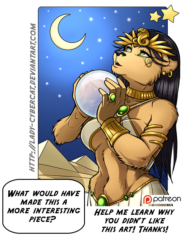
So obviously this month I'm focusing on figuring out how to better my art. I'm compiling a list of things to do, and not to do but I need your help!
For Pin Ups I've written down some guidelines for me to work from in the future.
Guidelines for better art:
Pin-up or Illio.
1 ) Make character unique and an individual
2) Give them a noticible expression. Super bright smile. A Pout.
3) Give them a prop and / or clothing from a gimic, hobby, or theme. Or Pet to interact with. ( Sports, types of foods, Profession, nationality, seasonal motif)
4) Have them look at the viewer.
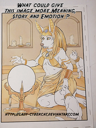
This older piece does some but not all of the items above. I'm trying to learn how much of a 'deal breaker' certain aspects are over others.
What would have made this piece more liked by you? Having a different expression? Maybe having her look into the crystal instead of at the moon? Having the image in the orb more pronounced or something else?
I really liked this piece, but it got very little favorites, so please tell me why! I want to make art that people enjoy!
Thanks for your help!
Submission Information
- Views:
- 785
- Comments:
- 12
- Favorites:
- 6
- Rating:
- General
- Category:
- Visual / Digital
Comments
-
-
thank you!
-
-
I love this piece a lot, but personally I feel like the moon is just too cartoony in comparison to the detail of the woman
-
Thanks for your insight. :)
-
-

I personally see nothing wrong with this piece.
-
Thank you!
-
-

I see nothing wrong with it I love it
-
Well, she either has a really short torso, or extremely high hips. The indent of her abdomen looks incredibly painful, from my perspective.
I'm not sure what material her outfit (white parts) is supposed to be made of. It's too stiff and shaped to be silk, and has a shading sheen that makes it almost metallic.
Her upper arm seems a little small for the perspective and pose, especially in comparison to her forearm. The contrast between her hair and her ear appears unnatural.
I mean, that's what I see at a glance over.
I do like the crystal ball, and the face you have appearing through it, and gazing up into the moon seems like a good pose, though I probably would've had the moon's glow a little more obvious over the ink lines. The pyramids in the background are nice, and set a good landscape for the entire piece.
Link
AJVulpes
Well, personally I enjoy this piece, though if i were to pick out something to make it pop more, make the background a little darker or give it more contrast