Sign In
Close
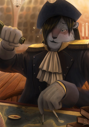
Another portfolio piece that I actually finished some time ago, but I saved it for when I have nothing to upload. ^^a
This was an attempt to draw Raid in a more realistic style, hoping he would look more handsome. I never knew he'd also look realistically more annoying.
Just look at that face. Don't you just wanna slap him? Heh heh.
Insignia © Xypress
Art by Xypress
Others: Prints
Interested in commissioning me? Check out the links below~
:: Commission Information :: Terms of Service ::
Submission Information
- Views:
- 415
- Comments:
- 6
- Favorites:
- 1
- Rating:
- General
- Category:
- Visual / Digital
Comments
-

-

Aww, thank you so much... (wait wut?) Hahaha!
-
-
DUDE IT'S SO AMAZINGLY AWESOME I WISH I COULD DRAW LIKE THAT SO AWESOME
(maybe i'll be able to draw like that one day but with my style and lost sence of reality it maybe a very very VERY long time from now)
but yeah its so Awesome
and yes i said this 3 times so you can get this message in your head it's not bad it so AMAZING XD
-
Ahahaha, thank you, thank you, thank you.
-
-

I'd say touch up some of the spots where definition is a touch splotchy, such as along his left cheek or along the left side of his nose. Generally, looks like the face is about 90% there, just needs a few little refining spots blended or smoothed out. The cloth could also use a little work as it looks a bit on the flat side and it's difficult to discern what material it's made of. The neck also looks a bit under-defined, but great job on the hair!
-
Thank you for taking the time to write a critique on this. The 90% was actually rather deliberate, hoping that the focal point remains on his face, and not to his neck and clothes. So I left it rough in order to not draw too much attention away. Perhaps it didn't go the way I wanted to.
Thanks again for the constructive criticism.
-
Link
Cashier
This is impressive! If anyone needs a slap it would be you for not realizing how good this look.