Sign In
Close
Hnnng...Finally this is done. This probably took nearly 20 hours (I lost count) and around 96 layers 8I
I was surprised Photoshop didn't die--well wait--it did freeze for a bit XD
Just...never again...I hurt everywhere XD
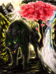
Well this is Gaia in humanoid version, she's a character from my comic. I thought it would be fun to see what she would look like as a fellow biped.
If I ever draw the other characters as human versions, I'm gonna do it in Sai where it'll take less time XD I don't wanna do this for each of them...it's simply kills everything
I'm gonna go be dead for a while~crawls into tomb
Artwork, character (c) Wolven-Sister 2013-Present
Please do not use.
Submission Information
- Views:
- 483
- Comments:
- 3
- Favorites:
- 2
- Rating:
- General
- Category:
- Visual / Digital
Comments
-

-
Finally I get a critique on this thing!! -dances- Thank you so much for taking the time to leave such a thoughtful and informative response. I'm actually working on a piece where different colors will clash and your insight will definitely help me in making it that much better 8D I can't thank you enough for your advice. I saw mistakes on this picture but I couldn't name thing or understand how to fix them, so I thank you for pointing them out to me and helping me understand <3 Thanks again Scatterbrain!! 8D
-
Awesome - Glad I could be of some help :)
-
-
Link
TheScatterbrain
Lovely motif! I wonder what she normally looks like?
You've requested critique, so looking at this there are three things I think could help your painting style immensly:
Before you declare the painting finished, spend some time sharpening the contours of the character and the different elements in the picture. All those soft brush strokes makes the painting look unfocused and kind of unshapely. If you want to soften some areas up it should only be where the light is reflected the brightest, like on her shoulder and forhead - but even then, be careful not to make it too soft. Anyway, even if you don't have actual outlines, it can help a lot towards making everything stand out more to darken the edges of the characters figure etc. here and there.
Actually her hair looks really great. It's a good example of what I'm talking about here - Strong contrast between light and dark and clear edges.
Don't overdo the rim lights! Like shadows, rim lights are great for making contours stand out clearly, but when you use them everywhere it becomes confusing to look at. Always keep in mind where your light source is. Here it seems the light source is in the topmost left corner of the picture, but then some things like her legs and the vines on the tree should be in shadow (from the tree) and definitely shouldn't have rim lights.
Also, the further something is from the light source, the less bright it will be lit. For example the right side of the tree won't reflect as much light as the left side.
Lastly, to bring the whole painting together more it helps to blend the different colours together. Colours reflect off each other which is especially noticable when two very different colours are next to each other. An example here is the red skirt vs. her green skin. If you mix a little red into the green shadows, and vice versa, in the area where the two colours are close, they will seem more natural together.
It's a bit hard to explain this concept in words so here's a simple example to show what I mean.
Hope you can use a bit of my ramblings :3 I can tell you're not afraid to be ambitious with your paintings and that's the most important part!