Sign In
Close
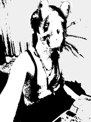

I had bought the premium video series 'Basic Rendering' From Ctrl-Paint.com and was pretty impressed by it that I wanted to incorporate it's ideas of breaking an image down into 'Tone' and 'Value'.
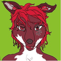
So I took a stock photo of a male figure and rendered it akin to a rodent character of mine; Molkov-Julien de Spade.
I'm also looking for a General Critique, but few specific qualities I'd like advice on is on how the colour is overal mixed; where is it weaker and stronger, and on the edges of shadows. I'm less worried about the anatomy, but if there's anything major, feel free to point that out.
Submission Information
- Views:
- 220
- Comments:
- 0
- Favorites:
- 0
- Rating:
- General
- Category:
- Visual / Digital