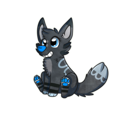
Oh critique time~
I really like the colors you chose for him. It gives him a very nice and friendly feel and the markings you used for John look great. Some people tend to add too many markings and it would be very hard to draw the character again without always checking the reference picture.
In my opinion you used just the right amount of markings. It's good that you use the pink color not only on his head, but on his tail and paws as well. The reuse of the color gives your character a good balance and it doesn't make him look random.
The blue gradient and the texture gives him a nice depth.
The only thing I would change is the right front paw. A dog wouldn't be able to tilt his paw like John does. I just checked it on my dog actually. ^^ It really helps to google some reference pictures to check the anatomy of wolves, dogs etc.
Overall I really like the character. He looks really cute and I like the slight chibi look. Keep it up. I hope my critique helps a bit.
It definantly help a lot! Especially the part about his front paw. I can definantly see where it looks akward now; next time ill reference! Thanks so much :)


Link
Bluefire-Amaterasu
Oh critique time~
I really like the colors you chose for him. It gives him a very nice and friendly feel and the markings you used for John look great. Some people tend to add too many markings and it would be very hard to draw the character again without always checking the reference picture.
In my opinion you used just the right amount of markings. It's good that you use the pink color not only on his head, but on his tail and paws as well. The reuse of the color gives your character a good balance and it doesn't make him look random.
The blue gradient and the texture gives him a nice depth.
The only thing I would change is the right front paw. A dog wouldn't be able to tilt his paw like John does. I just checked it on my dog actually. ^^ It really helps to google some reference pictures to check the anatomy of wolves, dogs etc.
Overall I really like the character. He looks really cute and I like the slight chibi look. Keep it up. I hope my critique helps a bit.