Sign In
Close
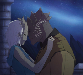
So I started working this out a little bit more. Apparently I have no idea about choosing right font and make it look right so, I might end up doing something custom in the end.
Critique encouraged : )
Submission Information
- Views:
- 442
- Comments:
- 9
- Favorites:
- 9
- Rating:
- General
- Category:
- Visual / Digital
Comments
-

-

Haha yea the font does make it look like a comic cover a little : P
-
But is it for a comic or a book?
-
book
-
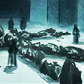
Ooooooh!! Well the front page is fine I see nothing wrong over there. The back cover text is where you might want to focus.
The lower opacity of the cube box, might want to give it a conture on the 4 concerns & a light stroke. (Option, play with bevel & emboss and slight drop shadow. For text input avoid san serif fonts and stick with either of these serif fonts within the box http://fontfeed.com/archives/top-ten-typefaces-used-by-book-design-winners/
Anything outside the box keep it San serif because that is where you'll be placing the production information and all the other stuff in making the book. Hope that helps and if it does turn out great do let me know. :> Good Luck!!
-
-
-
-
-

I LOVE the cover! The character's expression makes me so exited to read whatever story is inside.
-
thank you : D
-
Link
DarkWolf80s
WOW!! This looks great! Font wise tip, I suggest something would go with the theme of the story you're trying to put out. Maybe futura or typewritter text. Cause this looks like a good gore comic!