Sign In
Close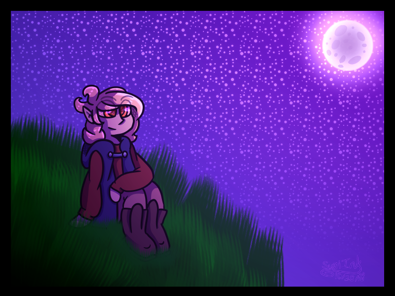
Been feeling iffy about backgrounds lately as they tend to feel plasticy to me with lining (especially with how I shade as it's simple cell shading usually), so here's some experimenting. It surprisingly doesn't take long, so that's nice.
For the sake of sanity, some star pens made also.
Submission Information
- Views:
- 444
- Comments:
- 2
- Favorites:
- 0
- Rating:
- General
- Category:
- Visual / Digital
Comments
-

-

Thank you so much for commenting! Getting critique like this is surprisingly rare.
Definitely understand the realism clash, not the best at making it work yet. I find that lining and shading everything normally can cause a plastic like feel, which I want to figure out how to avoid. Need to experiment with that still.
In the case with showing the eyes through hair, it's primarily to ensure that whatever character drawn will still have a readable expression. It's not necessary, but I think it helps, especially by how I draw hair. It should hopefully become less needed as I keep drawing.
-
Link
Darkythekat
Hi there, if you want a good, constructive critique then here it is! i'm here to help you out.
I've noticed you have a nice sense of style, which is great! adapting a style is crucial.
your character also has a nice pink-purple palette. that's great too.
Having your character off balance or asymmetrical is good as well, and the focal point is clear.
I also enjoyed the fact that you had a border. nice touch.
I wanted to just mention that your grass has a nice texture to it, but doesn't really go with the composition. the grass seems more realistic, while your character is more stylized, along with the moon and stars. id suggest next time, draw your grass traditionally, or make the grass blades thicker with a different brush.
id also recommend changing the colour of the grass so it has a pinker hue to it. since your sky, moon, and character are pink and purple, it would work so much better with your composition.
These are minor, but i would:
make the cliffside showable (meaning id add some land mass to it, like the bottom rock edge)
either make the cliff continuous along the bottom edge of the screen, or add more space between the sky in the bottom right and the cliff.
Also, you don't need to make the eye show through the hair. in my college it is looked down upon.
maybe add clouds?
Overall your doing great! The only way you can truly learn is by pushing yourself, reaching out to others, and continuing to draw every day, or as much as you can.