Sign In
Close
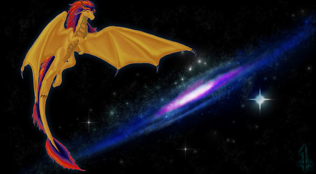
This be a commission piece for Dreigon, I experimented with shading to get this result, seems to have worked out
Submission Information
- Views:
- 213
- Comments:
- 6
- Favorites:
- 1
- Rating:
- General
- Category:
- Visual / Digital
Comments
-

-

Oh hoh! actual informative critique! Thanks a lot dude, Ill be sure to work on limbs in future projects.
Funny, back when I painted it i coulda sworn those wings were bigger... lack of foresight I guess
-
-

You did wonderful! I love your shading placement (but the colors used for shading stand out a bit more than they should on the dragon. I can see the purple/yellow of them and not sure if that's a norm tbh) and the way you did your mountains and background is just simply amazing!
The only things I can point out is the reflection in the water is a little too "still" for the waters ripples. It should be rippled as well, also they should be darker just a little and the white on the water should be blurred/softened a bit more than they are (as it is they look like lines rather than light shined waves).
With all those textures and awesome shading it makes your grass and hills stand out in a bad way. I would suggest maybe some blades or other form of grass texture to use for it in the background (maybe just something soft). I also feel the grass goes a bit too close to the water, there should be some sand/dirt/mud at least a little ways before you get to the water itself.
-
You know, youre right, I was experimenting with using different tones in my shading, and went too far with the blue/purple. So lets see... notes for further images:
1) More subtle tones in shading. Dont use vibrant blue, lower the saturation next time.
2) Darken the ripples and give them form, use more than lines for their crest
3) Keep consistent with detail, If the dragon looks good, the surrounding area needs to as well.
4) Learn how to draw grass (Hit the nail on the head with that one. Why the hell did I just use strokes?)
5) Grass -> Mud -> Water. Muds not pleasant in a serene landscape, but if theres a lake it kinda makes sense that there'd be mud.This is actually well thought out and helpful, Thanks very much for your input, its greatly appreciated ^^
-
Actually the blade-strokes around the dragons look good to my eyes makes it look like the grass is a bit over-grown in that area (which it would be in a non-inhabited area), I was meaning the areas that are solid green. I'm sure you could find/make a texture to overlay the green bits.
-
an additional note, to be fair I have recently seen some lakes where the grass goes right to the water in an area or two.. but the water was slimy/murky in those areas (more like a muddy pond than a clear lake) and I get the impression you were going for a clear lake. The best lakes I've been swimming at have always had a good few feet of sand leading up to it.
-
-
-
Link
Chaim
The details on the dragon are well done! c: You could work on the anatomy more. The leg, I don't think, does not bend like that, and the wings don't seem big enough to support the dragon's weight in flight.