Sign In
Close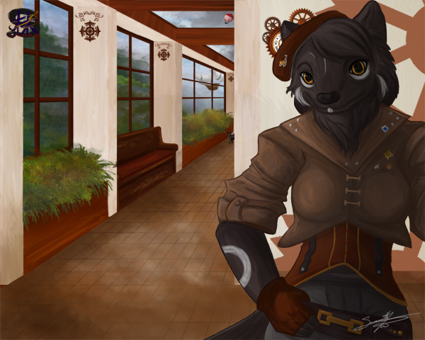
This character belongs to :iconLeinadObtrebla:
He provided a theme and I provided the idea, so here it is.
The hallway.
I enjoyed doing the clothing design, based off a steam punk theme.
My favorite part is the outside Bg, I loved painting the scenery and adding a few details like the the blimp and balloon.
I love the clothing and the coloring of her corset the best, and had a good time creating this image.
If you are interested in seeing the full clothing design you can see it here
http://www.furaffinity.net/view/13028320/
as well as the full picture process in my sketchbook
http://www.sammacha.com/art/sams-sketchbook/
-Samantha Lim

Cool Art, Prints, Commissions and More! - www.sammacha.com

Full Gallery: http://www.sammacha.com/gallery.html

Commission info http://www.sammacha.com/commissions.html

Facebook: https://www.facebook.com/Samantha.Lim.Sammacha
Twitter: http://twitter.com/sammacha
Tumblr:http://www.sammacha.tumblr.com
YouTube http://www.youtube.com/user/Sammacha
DA: http://sammacha.deviantart.com/
Submission Information
- Views:
- 473
- Comments:
- 4
- Favorites:
- 3
- Rating:
- General
- Category:
- Visual / Digital
Comments
-

-

Hmmm, well I can see what you mean regarding the fur. I was trying to use mostly the same tones but to bring it alive with the colours. I suppose I could sharpen it a little bit more, but i also wonder if its due to the shrinkage of the pic from original size, as I totally see a bit of loss of depth in the eyes :(
In fact the lines on the iris are hardly noticeable now...Ooo I totally tried shading the tiles so they each had shape, however we mutually decided to scrap the idea. I felt it was good in the beginning but became distracting as it went farther back down the hall. It also made the light reflections look a little off ( which is why i opted to have a few shades of the grout i there, but you cant really tell now.
These are great observations and I will defiantly build on them. Thank you moogle :)-

Great work, it must have taken you a lot of time! Moogle already said the most things I would comment, so just a few additional words from me. :)
(I hope I don't tell too much nonsense, English is not my mother tongue.. ^^; )Beside the style and the details I like the structure of the picture. It's not the 8503. character-in-the-middle-with-random-stuff-around but something more natural, more "alive". It's a scene just taken out of a someone's day where the viewer walks down the hall and meets another person on their way. I really wish there would be more pictures like this.
Concearning the fur, maybe you could use a few strokes of lighter hair here and there. Just a few. It doesn't have to be white or something like that but a color tone which is just a little bit brighter than the basic color. You already tried this but at least in my opinion the contrast you got is not strong enough.
About the tiles.. Maybe you should think about adding different levels of details. While things very close to us can be seen very sharp, objects in the distance are more blurry and less saturated. Of course, in reality you just begin to notice it while standing on a very long street oder on a mountain and looking around, not in a hallway. However, art always gives the opportunity to exaggerate a bit and often (spoken in general now) it is also necessary to make the viewer think that this has to be so to look natural. (Take Disney figures and their gestures and mimic in example. Play a scene, press 'stop' and look at the face. ;) )
What I want to say: To give your picture a little bit more depth and to keep the viewer's eye on the foreground, you could shade things further away less and give them less detail while working out the foreground as good as possible. Of course you should still make sure that the most details are on the main object/character and not on tiles and walls. :)Ok, now enough stuff and critique and whatever. Nevertheless it's a gread picture and I'm curious about the next submissions I might find here. ^^
-
Thank you for the very kind and well thought out comment/critique. This did take a bit of time to complete and I did struggle with it (as seen in my sketchbook thread in the weasyl forum). I think as always with commissions and such, the idea of the person hiring and the person drawing doesn't always seem to work out, so this is the compromise in the middle.
I agree with you on the structure thing. I do enjoy a more natural composition over a model posed picture at times. I am glad that you also enjoy it :)For the fur, I do agree that the contrast on the fur may appear to light. At one tiem I feel they were too bright because the lighted windows are in the hallway and not over her head (not that anyone could know that), at least that is what I was trying to convey. I suppose some extra highlights could be easily added and thankfully my friend Leinad would have no issues simply updating the submission files :)
For the tiles, I do totally get what you are saying. That the ones in the back would hardly have a shadow and the ones in the foreground would have a very clear one. Kind of like what I tried to do with the bushes inside.
I find that regardless of the total outcome be it happy or not, there is always a great deal of little things you can improve on. for now I will probably leave this one alone, I might touch up the hair and add a touch of detail to the tiles but that's pretty much it.
Again thank you so much for you kind input, I will certainly use it in the future. :)
-
-
-
Link
Moogle
Glad to see this finished! Looked like quite a hard task to tackle but seeing you pull through in your sketchbook thread was very fun to see.
I really like the overall look of this, and once again am wow'd by your background. You did a wicked job on the bushes, especially with the multiple colours - so pretty! As for the character, while the clothes are detailed and pleasing to look at, I feel the fur is almost blended into it. Around the eyes is where it's mostly noticeable, maybe sharpening along them and adding depth would help. As well, the tile on the floor (while daunting) could use some darkening where the creases are, however since the main focus for this (I would assume) is for the character herself, I can see why you wouldn't go this route.
Nevertheless, wonderful piece!
..
...
I SPY WITH MY LITTLE EYE, A CURIOUS LIL KITTY! :D