Sign In
Close
Submission Information
- Views:
- 609
- Comments:
- 4
- Favorites:
- 1
- Rating:
- General
- Category:
- Visual / Digital
Comments
-
-
Thanks for the feedback! (Yas! I'm only here for a few hours and already commentary!!)
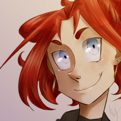
I've been really working on my character designs (mainly focusing on shapes and their combinations by this point), and I'm both glad and a little surprised I did this well in translating her personality and mentality visually to you! (≧ω≦)But I see what you mean about the detail aspect on the shirt. I admit I'm not very good at controlling many textures (i.e. not hair) sometimes when I'm working digitally without a base traditional media, so I kinda reverted to what I do with oil paints - flat clothing. Plus I'm aware that with digital work I tend to be very subtle with colours, which has served me well with colour choice but not so much with shading generally "smoother" surfaces. I legit can't figure out why I do this though, since I'm perfectly fine with shading in most any other media...
-
Textures are absurd monsters, there's nothing to be ashamed of with that. One of my best friends does incredible comics but she still to this day has NO idea how burlap works. From what I've heard it's just a matter of what you're looking to say. Sometimes it's important to emphasize the tiny details, sometimes it isn't. It definitely doesn't throw off the piece that the detail isn't there, but I thought that it might add a tiny touch more to something you've clearly put thought into.
Maybe if you're worried about textures you could texture over it some, then fade it in areas where you don't think shadow is needed? It might be a lot less intrusive and still let you get an idea of the thickness/nature of the fabric that you were aiming for. Marching band uniforms kind of have that look, where you can only see the seam lines when there is a crease. We'd actually get in a LOT of trouble back in the marching band days when our immaculate white uniforms seams could be visible when we assumed our flat-backed attention stance.
-
Ooh, that's a nice suggestion! I'm probably going to test that out. The only way to tell for sure is to try it!
Besides, a teacher of mine once told me "there is no master of Photoshop". Which makes sense, since everyone can achieve the same thing in hundreds of different ways.
-
-
-
Link
OhSynapse
Two words: Angle themes.
I love it when someone's got a shape in mind when they design a piece. It makes the features matching it 'pop' and you get a feel for the character. Sharp lines, steep slopes, firm shoulders are usually reserved for some pretty aggressive/angry/violent characters so seeing it be used for a character in a stoic and serious expression is interesting. The flow of the hair and the way she's looking almost looks like she was being called for and this is her, attention diverted, looking straight through and prepared to take charge. This is exceptionally done with those subtle cues.
You clearly have an affinity for color scheme with using bronzed/aged/greyed hues to insinuate a rigid leader with stubborn traditional values that shouldn't be undermined. Really the only thing that I can think of in this image that may need adjustment is that I'm seeing that her shirt lacks as much detail as the face. It doesn't need anything big but I think that (strange, I know, but bear with me) if you put a very subtle pattern onto the shirt to show where it slopes and curves slightly, you could get that 'tense' and focused look more emphasized. Maybe a few extremely thin vertical lines that suggests a straight back and focus right on the viewer.