Sign In
Close


After completely redrawing the shield for the fictional society in my comic, I figured I'd take that momentum and get to something I've actually wanted to do for a while.
This is one of the few designs of mine that I actually had a shirt of. It lasted for a fair bit but, once I got it in my hands and wore it for a while, I noticed stuff I wanted to tweak. Small things but things nonetheless. Like many plans, it fell by the wayside.
Well... I finally got around to fixing those issues up tonight.
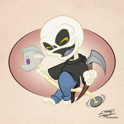
I gave it a bit of a cleanup:
- The top font didn't feel old enough. It worked but I've acquired Quite a bit more fonts since 2007 so I switched it out for the present art deco-styled font.
- Although I still liked the artwork, it used only the most basic of basic brushes. I switched those out for ones I've built for comic and design work that mimic how I ink (with a few scooped up for other comic folk).
- I changed the bullseye in the background from a simple circle with a pattern on it to an actual set of rings. Still not sure why I didn't do that originally. -.-
- Added a white line around everything to make it stand out a bit more on darker items.
Overall, I like the updates. The image feels new despite being last worked on eight years ago. Now I just need to get this on a new shirt... = )
If you wish to see the original, you can find it here - (Link)
Submission Information
- Views:
- 233
- Comments:
- 0
- Favorites:
- 0
- Rating:
- General
- Category:
- Visual / Digital