Sign In
Close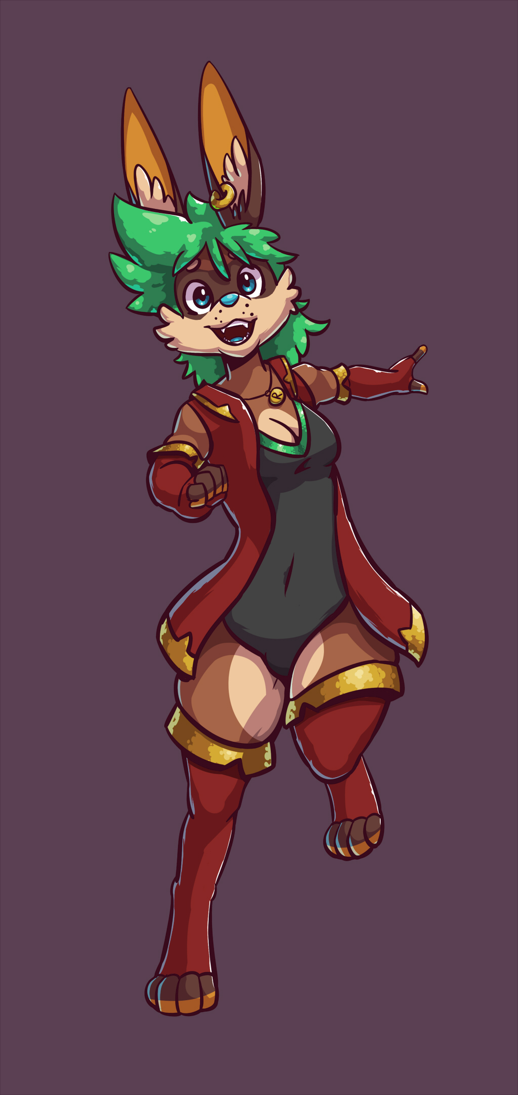
all 3 of the recent drawings I did focused on this new shading but also with that focus on dramatic light sources, so I wanted to try my shading on something that was just a regular picture and not that dramatic
Also a good look at my new Fursona revision if you haven't seen it! This image is from my new ref sheet that I'm working on that eventually I may complete (maybe) It wont be shaded there, I just wanted to experiment and this drawing was ready already
I did a lot of little stuff to add flavor to the shading instead of just solid lines
Also tried to shade the shiny parts, very experimental stuff
Submission Information
- Views:
- 754
- Comments:
- 39
- Favorites:
- 10
- Rating:
- General
- Category:
- Visual / Digital
Comments
-

-

I don't know. It makes sense to draw some characters with a longer torso if that's how the animal is.
-
sometimes like weasels or somethin' like that
-
-

Hmm
-
yea you're right
-
so like I did a 3 second edit on it and I'm not really sure I like it https://twitter.com/FxSql/status/1022022036183568385
It brings her to be more proportioned to humans, but she's not really a human, and I like her legs being more short and stout. It's definitely something to be aware of though
-
Just a small change like that can change a lot in a picture! Good job
-
-
-

Your strengths in this piece are the textures, posing, and color. The gold areas and head hair have a well defined texture and shape. The positioning of the facial expression adds a positive atmosphere while the body positioning adds a fresh view. The mix of complimentary colors and split complimentary colors are pleasant to look at.
Your weaknesses are the finger visibility, background, and shading. The position of the thumb on the open suggests the back of the hand would be visible, showing the rest of the fingers, while the thumb on the closed hand does not exist. The only representation of a background is the color without any shading, lighting, or scenery leaving me with questions about what is happening (where is she at with such an expression? What is she doing in that pose? ). Inside the shading is a white area that suggests backlighting vaguely while the darkness of it suggests an incomplete coloring.
The piece is pleasant to look at but I am left without a scene to explain what's happening.
-
the thumb is there I just didn't color it properly, I fixed it now for when I use the picture in the future
that's also why there's no background because I'm gonna use it in the future and mainly it was just a shading practice
-
Why should there be no background?
-
Backgrounds take extra time
-
Using a photo or a 3D generated background is an alternative to drawing one. Slap it on the background layer and you have an instant scenery.
-
It'll clash and look incredibly lazy
-
A foreground should be adjusted to fit the lighting of the background. With a new background introduced, it may not line up with the previous lighting details that were added, it may take extra time, it may look lazy. Replacing preexisting highlights and shadows with ones that match the new background is a solution.
-
but like, why would I even want to deal with the extra work in the first place? The piece looks good on its own without a background, and not everything's gotta have a background. Case in point, our avatars dont have backgrounds
-
Your current avatar has a simple 2 color background with lighting that blends with the foreground. My current avatar is grayscale with no added background. Which is more appealing to you?
-
the one I drew, of course, but I have bias
-
Would it look more appealing or less with a 1 tone background?
-
when rounded on social media which rounds avatars, only one tone is visible and it still looks ok
-
Having a background with more than one tone (in any art piece) is an improvement to the void that is an empty background.
-
the one I did previously had a simple 2 shade background tho
-
Which is an improvement over a 1 tone background and still leaves room for improvement.
-
yea, but in the end you really dont gotta have a background all the time I think
-
I never said you have to.
-
but you suggested it, in saying on multiple drawings that they didn't have a background, and therefore left the drawing having an incomplete feeling
-
I sure did. Thanks.
-
oh!! you're welcome
-
For further examples on pieces that look complete, check out my favorites.
-
Ah yea, only a selection of those have backgrounds tho. I did see the one that was a bust that was a transparent png where you said it should have a background and full body tho, is that the one I should be checking out?
-
Yes. Chop your artwork in half and leave a transparent background and center that art so that it appears to float. Totally what I meant.
-
oh ok! glad we're on the same page
-
You can check my latest upload, in the comment area, for a more detailed description of this series of comments.
-
-
-
-
-
-
-
-
-
-
-
-
-
-
-
-
-
-
-
-
-
-
-
-
Link
sinisternoodles
Awesome character!!! Although I see one minor mistake, the torso, it's a bit too long. It's a problem that I struggle with as well. The only solution is to look at anatomy pictures it really helped me out.