Sign In
Close
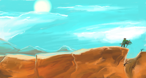

Some more artrage fiddling to make up for the lack of update yesterday.
Done for the sake of a friend.
Submission Information
- Views:
- 503
- Comments:
- 4
- Favorites:
- 0
- Rating:
- General
- Category:
- Visual / Digital
Comments
-

-

It does actually, thanks ^^
A fair bit is me fiddling with this software(one of artrage's fun is that the brushes don't just have bristles... the software literally simulate paint and paint thickness), but every bits helps :)
-
Link
Doki
I really like how the teapot is clearly rounded and not flat., but the top of the lid gives me that flat feeling since it's not really shaded enough. Otherwise the shading is wonderful on the rest of the teapot.
As for the background it doesn't really match since it also has that flat look to it. If you maybe included a table cloth or some other object to give a reference to the teapot (but not to make it more busy) I think that would help it a bit.
For the steam, steam should be more invisible than smoke. Unless something is smoking in the teapot. So you might want to instead use a slightly lighter version of the background colors rather than smudging.
I hope this critique helps!