Sign In
Close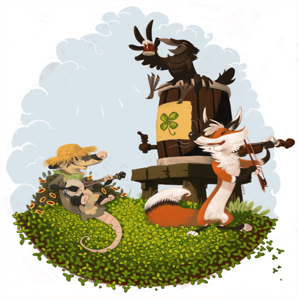
A drawing i did for Patrick's day.
As you can see, i wanted to use back characters from that old comic project i had, as much as i wanted to rework my style entirely at this point.
I was growing bored of the regular cartoon like pictures i was doing, feeling like i wasn't trying new stuff and just staying in my confort zone.
I think that's where i started to look for something more... meaningful to me.
Submission Information
- Views:
- 665
- Comments:
- 4
- Favorites:
- 9
- Rating:
- General
- Category:
- Visual / Digital
Comments
-
-
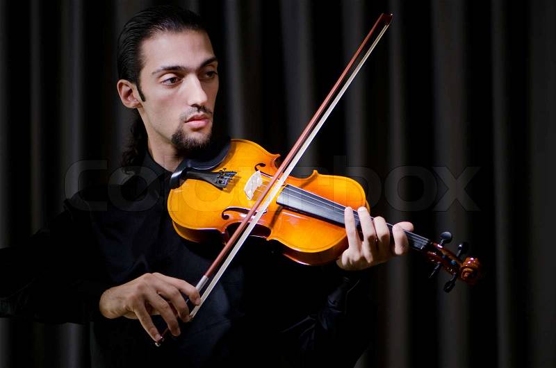
EDIT: I neglected to mention, but the fox is also holding rather high and doesn't actually appear to be gripping it. Here's a photo with a general hand placement/grip: http://www.colourbox.com/preview/3093022-178300-young-violin-player-playing.jpg
-
The bow, that is.
-
-
I have to say you did a pretty good analysis on this one. There's a few values problem i didn't really fixed about the nose and crow and keg placement. I think i would, like, move the keg slightly to the left so it can lower the void on that upper left sky, creating, you know, a triangulare composing.
There's a lack of light details on that part too i agree. As much as i realise according to the ellipse from the keg, the wooden stool would have been seen from... a more straigth perspective too i guess. But it doesn't really chock that much surprisingly. ^^As for the way the fox hold the fiddle, it's totally wrong and badly done i admit, haha x) I think it would work if you consider them as about to play, like, grabbing their stuff and placing their hands and all.
Though i remember having quite a good fun drawing these instrument. Never drew a banjoo before and damn that's a really beautiful instrument i find.I remember planning to add white or black text on this one, especially in that upper left sky part. Though i never really took the time to think about one.
Otherwise, thanks for the critic. It really helps me =)
-
Link
asterionblazing
First off, the characters themselves are very lively and I can appreciate how the vignette contains the piece without feeling restrictive, if that makes sense. The rendering, though simple, doesn't read as flat, and I still get the sense of a sunny day even with the somewhat desaturated palette.
The things that really stick out most to me are how close in value the crow, keg, and the fox's ears/nose are. They all just sort of blend into each other. I think maybe lightening the keg and shifting it to a slightly cooler brown would help to separate the elements more effectively. This closeness in value also occurs (though to a lesser degree) with the possum and bush he's reclining on. Also, as someone who's had formal violin training, the way the bow is set to the strings is incorrect for the angle the instrument is being held. It looks like the fox is playing with the bow being held on its side, as opposed to having it hair-side down on the strings. We wouldn't be seeing as much of the broad side of the frog (the black part of the bow), either. On the background, though there is a bit of lead-in to the rest of the image with the sun rays in the sky, the space still feels a bit empty and it would have been nice to see some other element filling it, especially since the direction of the fox's head leads the eye right back to it..
There are a lot of good things going on with this piece, and I'm still discovering little things here and there as I look and re-look (I just noticed the excess string curling around the banjo, ha!). I was watching you previously on FA for a while, but I'm definitely looking forward to seeing more of your work. All the best!