Sign In
Close![[FIG] mock swordfight samurai](https://cdn.weasyl.com/~hareteeth/submissions/615274/4f19a0c28e491835095e2618133ed3b29b439ce1b66f6c11326e510b223c30d5/hareteeth-fig-mock-swordfight-samurai.jpg)
![[FIG] mock swordfight samurai 2](https://cdn.weasyl.com/static/media/05/11/dd/0511dd7445ab1686d551341df3a8c468c2c88ce0e54482187ab8b14818000d4c.jpg)
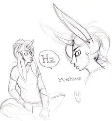
I'm just gonna toss up a few of my older figure studies I still like? For diversity's sake? This is probably of no interest to anyone but me.
mixed media.
I remember the plot as "a samurai and his apprentice have a big swordfight because they are actually in love" this might be around the moment when they are admitting their feels at eachother.
Submission Information
- Views:
- 216
- Comments:
- 3
- Favorites:
- 1
- Rating:
- General
- Category:
- Visual / Traditional
Comments
-

-

I like bringing different media into a figure drawing session, graphite/charcoal/conte is great alone, but I also did a semester class where we worked simultaneously wet and dry, and it was loads of fun.
I used markers and watercolour, I may have let rubbing alcohol join the party. Yeah, the warm/cool difference for the back and front, also because of the context, I choose warm, vibrant colours for the apprentice, while the master was done mostly with pale or deeper cool tones. I also did the apprentice in watercolours, to give him a passionate but also a bold and brusque feel, while the master was mostly marker for a more controlled and stipulated feel. Mostly to show their emotions about each other: the apprentice is full of energy and confidence, while the master is more hard and defined...in this one, he sort of begins to warm up and loosen. In another, they both are watercolour to get a more sudden and urgent feel, because they are trading blows, but here the one has defeated the other.-
The Apprentice is closer to being a expressive silhouette. I guess the reds and oranges help add a sense of flame/passion to him. The masters purple linework I did think was markers, and the blue I thought was an inkwash could be what you've done with the rubbing alcohol.
-
-
Link
Vosyl
I F'ing love Mixed Media. Despite already on a full-time course I managed to wraggle my way into the evening night course for mixed media and it's one of the best things I've ever studied. What did you use for this? And what were you thinking when you used the colours? I can pick up the the closer to the foreground the redder and more intense they are, while the more distant forms become bluer and paler.