Sign In
Close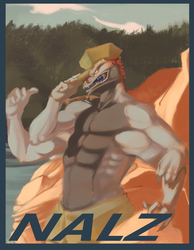
Now in super pretentious art-o-vision!
I can feel a style forming here, which is something that I'm 95% okay with! :A
Quazy © Danny-mad-Quazy
Art © Myself
Self-Critique: I can say without question that I've been happier since doing these expressions. Having the freedom to be loose is quite a refreshing experience. I'd imagine the happiness comes from how most artists have a natural sense of emotion and going along with that makes these much more fun to do. Normally I wouldn't include my emotional status in a picture but in this case, it's important to know I'm in a good mood when reviewing, so that people will take what I'm about to say with a grain of salt.
Now on to the critique: Unlike in your many other pictures, the expression here is lovely, intoxicating, and informative of the character. Not only the face but the body itself implies an almost reclusive nature and after researching the character to a certain extent that's exactly what I was going for. This was not a fluke and it's good to know for my next picture. It will allow me to act with confidence. The colors are still quite a bit washed out however and it doesn't meld with the style of form you chose to go with. If your character is going to be vibrant be sure to make the colors equally vibrant at least as far as the character goes. It's all about evoking an emotion. Perhaps a modified version of this style of drawing is what you need. But seeing how well your other modifications have gone another style of execution may be more helpful. A final note on color, this style is good for realistic pieces and landscape. The red however is very well used and executed and perfectly vibrant for the picture. Moving on to execution of the final material... mneeeh it's lackluster at best. Clearly visible brush repetitions like in the river and such are unacceptable. Having a background that's blurry and hardly thinking about how you do it are two different things. However deciding to leave a few of the lines in there was a very good choice. It gives the picture a stylized look and having done this with the whole picture gives it a sense of unity. The eye moves fairly well around the picture, but the balance is a bit off in the right side's favor but while it's not like it's unbalanced to the point were you might as well be leaning totally horizontally (see Nalz badge) you could definitely do better. Do something with the background next time. NOW, as far as texture brushes go, stay away from the with badges like this. It only serves to take away from the finally product since it's not realistic. Save texture for realistic pieces. If you do anything with texture focus on how the value on the shirt would differ from the value on the skin or something like that.
73/100
What should I do for the next piece:
-More of this. Gaining experience in a certain style would definitely help more than skipping around all the time. The only thing you should change is what's mentioned above.
-I feel you've found a good marriage of expressionism and detailed works. However keep working on expression. Do more expression sheets.
-Focus more on final execution. Getting emotional in your work is fine but learn to refine it at the final point.
-For these badges remain monochromatic in the background. Having an actual background is fine but leave it a variation of a single color.
-The speed on this piece was acceptable but while you shouldn't focus on it in the next one, it's at least worth mentioning since deadline's are indeed a thing and your client will be happier with a speedier artist. However skill is and will always come first.
Submission Information
- Views:
- 252
- Comments:
- 1
- Favorites:
- 3
- Rating:
- General
- Category:
- Visual / Digital
Link
Happysorry
for critique: don't be afraid of lines, even if you want to paint lineless sometimes you need that dark shade to bring out your characters definition <3, you're doing wonderful and seeing what you need to do thats great! Even if you do speed paintings, those are only for practice or doing quick paints of what the image will look like, then you put the rest of the time into it may it be hours or days. And to make the character pop out of the backgorund <3 pick a background color thats opposite of the character, if the character is red, like so, maybe a green would suffice. Many of the old artists use color opposites to bend the picture to their will.