Sign In
Close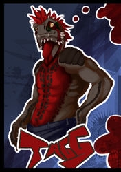

Slightly better than it's predecessor! :)
Ratharn (c) Ratharn on FA
Art (c) Myself
Self-critique: You can go ahead and give yourself a small pat on the back for this one. Be sure to give an even bigger thank you to those whose art helped you along. Otherwise this would not have been possible. That being said, the style is slightly discomforting. Lots of small details and that kind of thing doesn’t seem to be compatible with your style simply because the expressitivity (though that’s not a word) did not match the style of shadow. Also, you spent far too long on this. 3 days? Really? You’d be fired so fast by anyone who would be daring enough to hire you. You may be able to solve this by developing a style and looking into shadow shape as the primary means of shading. Also start to work strictly in digital. While it may be slower to sketch out in digital, it’ll serve well as practice and you can add details on the fly. Also your choice in color was…. questionable. The belly was far too vibrant and the highlights were far to bright which took away from the focal point which should have been the eyes but the eye winds up following the blue on the belly scales. Granted, the yellow you put in the eye to make the purple pop out was definitely a good idea the problem bearing is that no one can see it thanks to the overbearing brightness surrounding it. Another thing this piece was part of a duo, but it doesn’t seem that way. There’s a clear distinction between the left and right characters in both quality and application of color and light and it leaves the two, as a whole, inconsistent. That is the exact opposite of a duo. The two should complete each other however both would look better off on their own. Lastly, again final execution was a bit sloppy and considering you took 3 days to do this, that’s embarrassing. The hand supporting the head should have been more vivid in order to stress the already weakened focal point the outline is blotchy because you never took the time to make the outline more defined. Again, you wasted your potential on this picture, though it’s easy to say that you did to a much less degree than your last, so you may claim that improvement took place.
64/100
Experiments/ Improvement suggestions:
-Use the multilayering method smarter. You could have easily used this to make the fur more captivating.
-Research textures of what you’re drawing: If a character has a piece of metal on him, find a picture of metal to see how light would work with it. Same if the character has fur, or horns, or eyes. Look at the texture. Is it reflective? Is it rough? Then capture that in your images.
-Develop a method for drawing to increase speed. (First do this, then do that, lastly do this)
-Once you have your technique down, learn to stylize. Suffice it to say your artwork is currently boring to look at.
-Next time you do a piece. Do them both at the same time to conserve consistency.
Submission Information
- Views:
- 777
- Comments:
- 1
- Favorites:
- 4
- Rating:
- General
- Category:
- Visual / Digital

Link
Grilder123
Yaaaaaaaaaay Rath