Sign In
Close
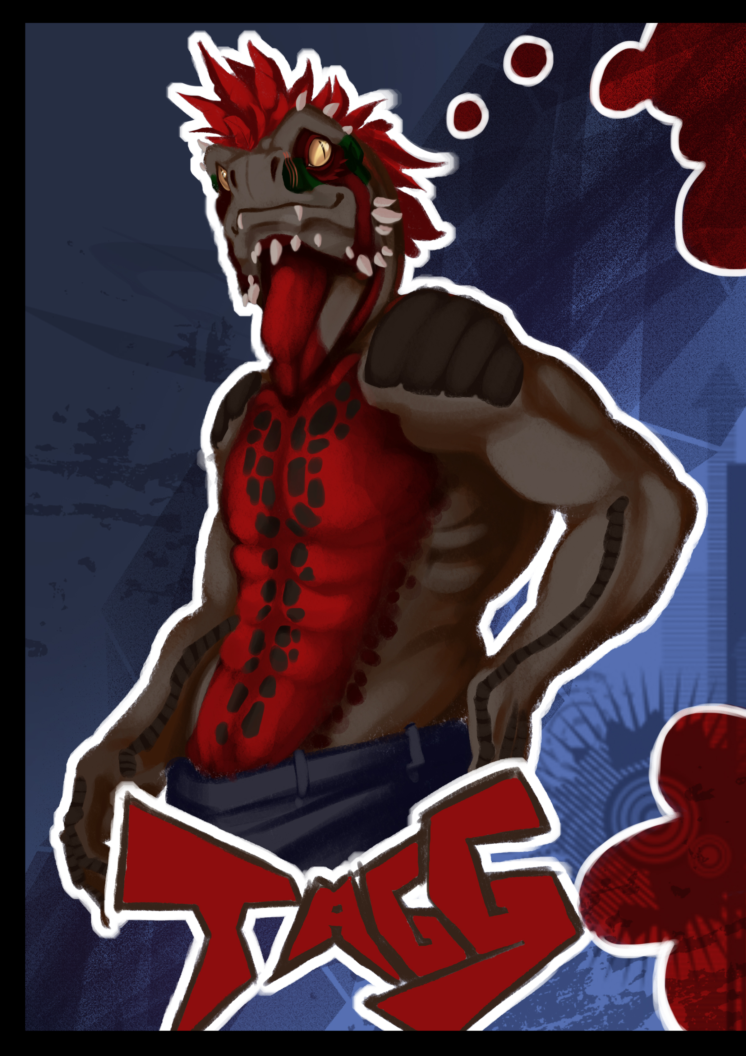
The Predecessor
Tagg (c) Taggcrossroad on FA
Art (c) Myself
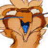
Self-Critique: Lazy. Sloppy. Poor execution. All would be words used to describe this image. What started out as a decent sketch with potential fell apart the moment you sacrificed quality for speed. This could have been a good picture but it wasn’t. You didn’t focus on the light source directionally, color wise etc etc. You managed a good idea however. The concept of a two part badge where the two characters therein are thinking of each other is a decent idea. The colors are…. Okay but you should have made them less vibrant and at a lighter value. That is something I would spread to the entire image. There is entirely too much dark value in this image and it throws off the captivity of there actually being a light source. To add to it there is an overuse of texture in this image. Ultimately that should only be used for the initial colored sketch. But I guess it looks pretty for what that’s worth but it’s a total fluke.
43/100
Experimented with/what to improve on for the next picture:
-Textured brush- only used this in the sketch up for the colors until you learn how to use them appropriately in a finished picture
-The color black- Adding small amounts of a certain pigment will give your black characters a bit of depth color wise. So do what you did with this picture. Make sure the color you use however is desaturated enough and inside the viable color scheme.
-Using multiply layers to get down an initial color on shaded areas- this is good keep using this technique.
-Learn to use many layers for making worry free marks on your images
-Plan out the image more. You wound up cropping some of the name and that looks bad. It takes the eye off the page.
-For the next image plan a more well designed background. Random brushes won’t do it anymore.
-Restudy the ctrl+paint videos on color.
-Pay closer attention to anatomy. Even if you make a mistak you should be able to fix it in the final product.
-Take more time on your “final touches”
Keep learning to push that expressionism. Learn to use the body for expressionism as well.
Submission Information
- Views:
- 507
- Comments:
- 0
- Favorites:
- 5
- Rating:
- General
- Category:
- Visual / Digital