Sign In
Close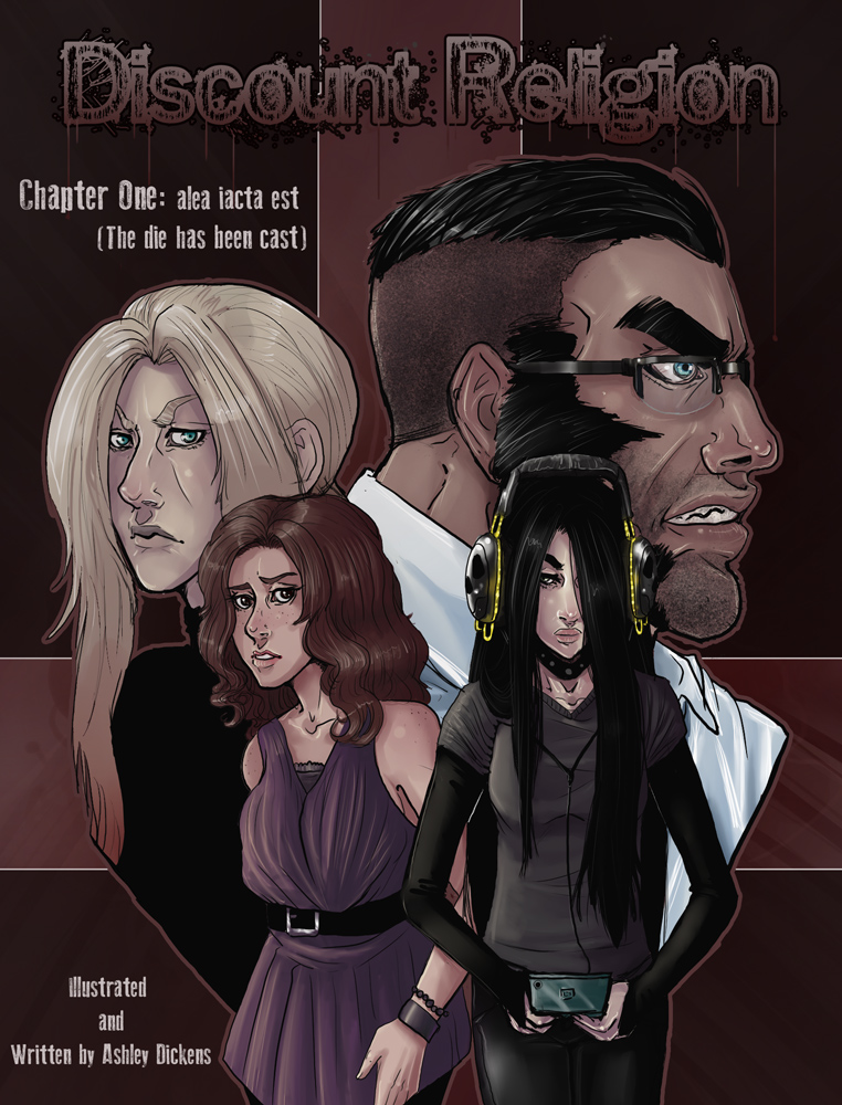
Cover for the first chapter of the comic
Submission Information
- Views:
- 523
- Comments:
- 2
- Favorites:
- 1
- Rating:
- General
- Category:
- Visual / Digital
Comments
-

-

Oh thank you SO MUCH for the critique. Not very many people take the time to type up some well thought out critique so I wanted to thank you. The clothing and rendering and figures are shortcomings I'm pretty aware of sadly. It's just something I'm having trouble grasping but I feel I'm getting better. Though something I wasn't noticing was the man's eye and glasses. That is a glaring anatomy mistake that I have probably committed multiple times without even thinking about it. So I will definitely work on that. Though I think I was kinda going for a not completely to the side view since you can see some of the eyebrow and lip fromt he other side but..it's wrong either way..XD.
-
Link
asterionblazing
I'm always glad to see human characters in art on this site, and this piece is no exception. I think you did a decent job with the clothing in the piece. The brunette's top feels billowy and hangs from her body convincingly, and the bunching of the fabric at the goth girl's t-shirt sleeves is a nice touch (though I think the line at the swell of her bust is unnecessary), and I'd likely be able to distinguish between the women even without color.
Speaking of color, though, I feel there are some successes and some things that could be worked on. The skin on the figures is handled nicely and manages to be rendered with just enough highlight and shadow to give them a sense of form. I don't think the coloring of the clothing and hair was as successful. I feel like there are a lot of extraneous strokes in their hair and clothing highlights that I feel would have been better handled if they had been approached as the skin was. It's not too bad on the brunette's hair, but it really stands out in her clothing and in the blonde's hair as well. I think in the effort to make them feel like hair/folds, you've done a bit too much. I don't think the coloring is bad, but it isn't as refined as your drawing.
The only other thing that's really glaring to me is the fellow in glasses. Though he's in profile, both his eye and his lens are plastered to the side of his head, when we wouldn't be seeing nearly as much of either at that angle. Here's an example of how they actually appear in profile view: http://www.imagesource.com/Doc/IS0/Media/TR3_WATERMARKED/8/f/6/4/IS0997Y2W.jpg I know showing much of the eye in profile can be a stylistic choice in some cases, but doesn't really work with realistic or semi-realistic characters such as yours.
The piece is solid for the most part, but would benefit from a bit more refinement and a more careful eye when it comes to your figures. That's about it, I think. Best of luck in your artistic endeavors!