Sign In
Close
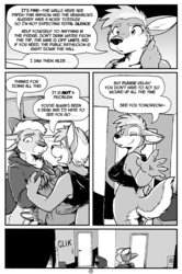
Well, that didn't take long at all!
If you'd like to help support this and other comics and stories, please visit my Patreon! http://www.patreon.com/rickgriffin
Submission Information
- Views:
- 2061
- Comments:
- 13
- Favorites:
- 32
- Rating:
- General
- Category:
- Visual / Digital
Comments
-

-

Well then I'll just have to avoid typing the word flick
I might use a different font for future issues
-
-

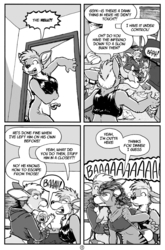
Ali is as effective as any bomb!
-
Oh gosh Ali...
-

X3!! Ahahaha oh dear. And this is why NO ONE should ever have kids. X3 jk its so cute
-

Ali looks so happy and accomplished <3
-

Ha Ha I used to do that when I was that age Ya that was the life
-
THIS IS EXACTLY WHY I WILL NEVER HAVE CHILDREN
-

Kid's so proud of himself. Hah.
-

And I stay for kangaroos
-

this makes me laugh so hard XD
Link
Occoris
Kerning on this font is a little bit bad, man, on the "L"s especially. Next to an I and it reads more like a U at first glance