Sign In
Close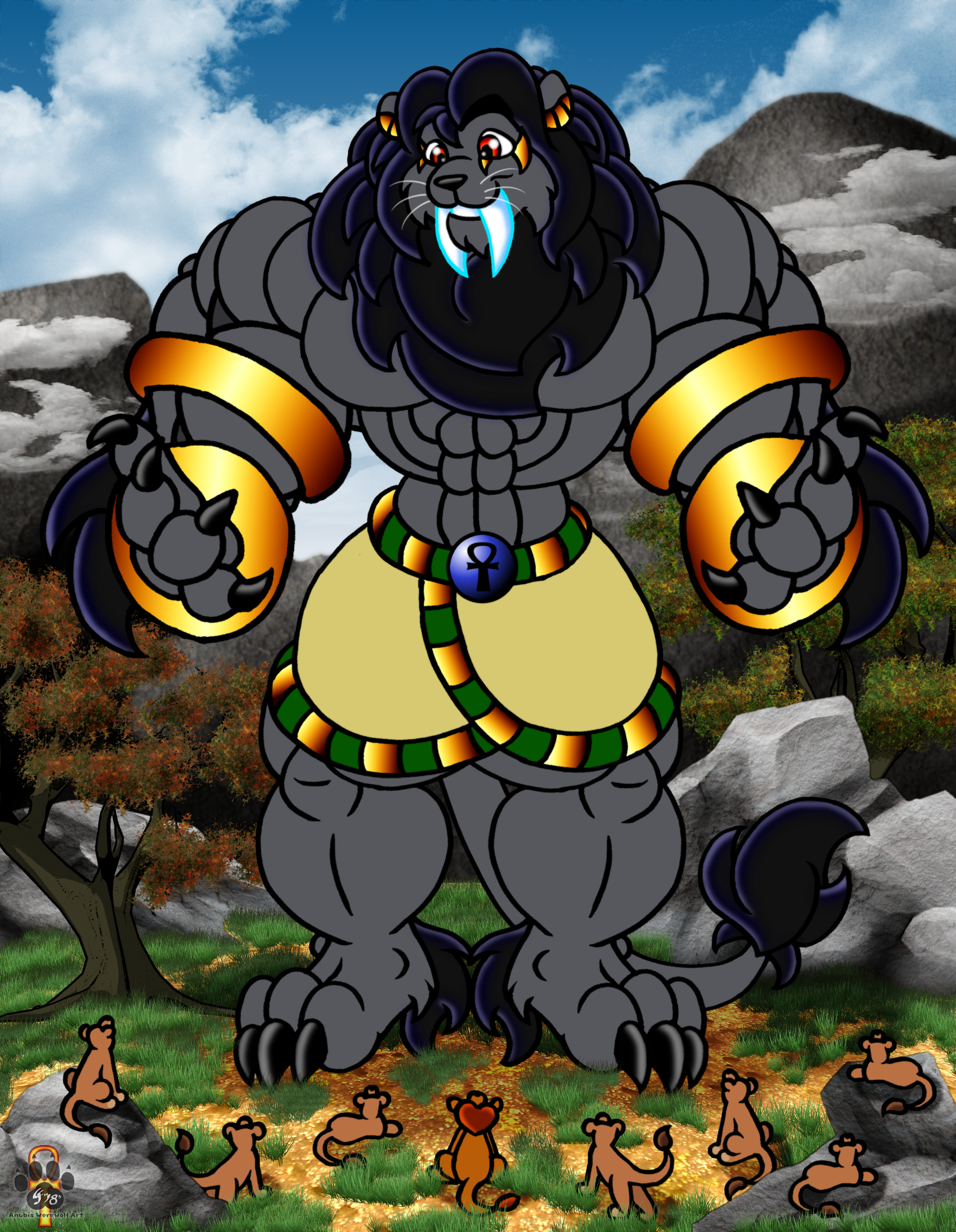
AnpuRa in his huge sabre lion form comes across a pride of lions. AnpuRa being the friendly sort, greets them. ^,..,^
A revamp of AnpuRa's lion form
http://www.furaffinity.net/view/20825855/
Submission Information
- Views:
- 795
- Comments:
- 6
- Favorites:
- 7
- Rating:
- General
- Category:
- Visual / Digital
Comments
-

-

thanks
I do vary my line width. I go over the entire pic to clean up edges and taper lines before I begin colouring.-
I see the tapering, and that's a good technique too. :)
In this case, I mean more like using an all-around thicker line for the basic outline of the character, and thinner lines for things like specific muscle groups, facial markings, finer details. It's something a friend suggested to me that helped my own work look a little better, which is why I wanted to share with you in turn.
-
thanks for the tip.
Though I like my style. I think I do a good job using a mouse.
I've tried the thicker outside/thinner inside line work and it just made my characters feel off. Like they had a black glow around them from the line width difference. It is just how I have developed my style over the years.
Whether it is wrong or right, that is up to the viewer, but it's mine. ^,..,^-
Doesn't have to be quite that drastic of a difference ... but I see what you mean. Keep up the good work, yeah? :)
-
-
-
-
-

Woa-hoah! Now THIS guy is a great looking king of the pride. Hyenas, you should watch your tails! ;-D
Link
Luprand
Adorable!
I think your style would benefit from varying the line width (keep the outer lines that thickness, but use thinner lines to delineate the abs and other inner details). That will help emphasize the main shapes in the viewer's eye.