Sign In
Close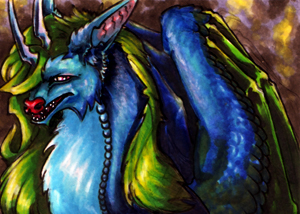

Second art card for Spyn.
Submission Information
- Views:
- 425
- Comments:
- 7
- Favorites:
- 2
- Rating:
- General
- Category:
- Visual / Traditional
Comments
-

-

I have to agree with Zy on this one--ALL THE COLORS. The contrast and use of vibrant palette is awesome :D Not an easy thing to do with blues and greens mixed in the same image piece.
-

I will tell you one thing though, the stark green on her wings scanned in at a much sharper contrast than what actually exists on the paper. I think I either need to scan again, mess with the levels, or lay a darker tone over the green to cast it in shadow. Blues and greens together continue to pose a real challenge translating from the paper to the scanner, so, I'm glad you think I at least did a half-way decent job!
-
I'm honestly not surprised the scanner might have messed with the shadows and color tone a bit. When I used to do more colored traditional art, my colors would wash out and make the image look too bright, and darkening it with other tools made it look horrible >_< Scanners can be unforgiving sometimes, but I think yours did a great job holding the tones despite it being more vibrant on paper IRL
-
-
-

Stormy monster is stormy~ <3
Link
Zyleeth
The colors, duke!