Sign In
Close
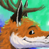
Playing around with more impressionistic paint work. It's actually a lot of fun, and I liked this so much I decided to make it my new avatar. It was in desperate need of updating anyway!
Submission Information
- Views:
- 476
- Comments:
- 9
- Favorites:
- 4
- Rating:
- General
- Category:
- Visual / Digital
Comments
-
-
Heehee, thanks! They're a popular feature!
-
-

this is cute! i like the rim lighting
it's marked as crit requested, was there anything specific you wanted crit on?-
I wanted to bring a bit more color into his head so it wasn't just a huge blob of orange. I'm glad you like it!
As far as critique goes, a couple of people have mentioned that the smile looks a bit "drawn-on" compared to the rest of the piece. I dunno what to do about that, though, because foxes have pretty dark lips! Do you have any ideas for what I could do differently?
-
hmm! im lookin up refs of foxes really quick as i'm not familiar with their lip color/structure
i'm lookin', i can see the 'drawn on' effect but i think it's sort of a misnomer-- it might look a little odd because of the way that what is essentially the 'shadow' of the image is very flatly lit? you MIGHT adding a subtle gradient down across the muzzle, and blending some 'fluff' into the top side of the mouth edge so it's not such a stark line all the way through. does that make sense?
-
Yeah! I reuploaded the file, after adding a short gradient and tweaking the mouth, particularly the edges and the corner. I also adjusted the frame a bit so you see more of the lower jaw; I think that helps a lot. What do you think?
-
yeah! it's subtle but that pushes it a little more into relief. it still looks a little too 'chiseled in' imo-- out of curiosity i went in and did a lil sloppy blending (i hope that's okay)-- http://puu.sh/6JhoP.png
i tried leaving the areas with the biggest actual 'dip' and therefore the biggest shadow fully black, but blending some of the 'lip' area, where it's much more shallow and there's more room for light to bounce around. this might be too soft for your taste though. thoughts?
-
I see what you were going for! What helps the most is that the blurred areas aren't as dark, so they don't stick out against the near-white parts nearly as much. Maybe there's just too much contrast?
-
yeah, contrast is exactly it. contrast of various types, value contrast or sharpness contrast or etc, is what defines the quality of an 'edge' in 3d
-
-
-
-
-
-
Link
Axelshane
I like it :) I think its a pretty neat avatar. I love the antlers on your fox as well :P