Sign In
Close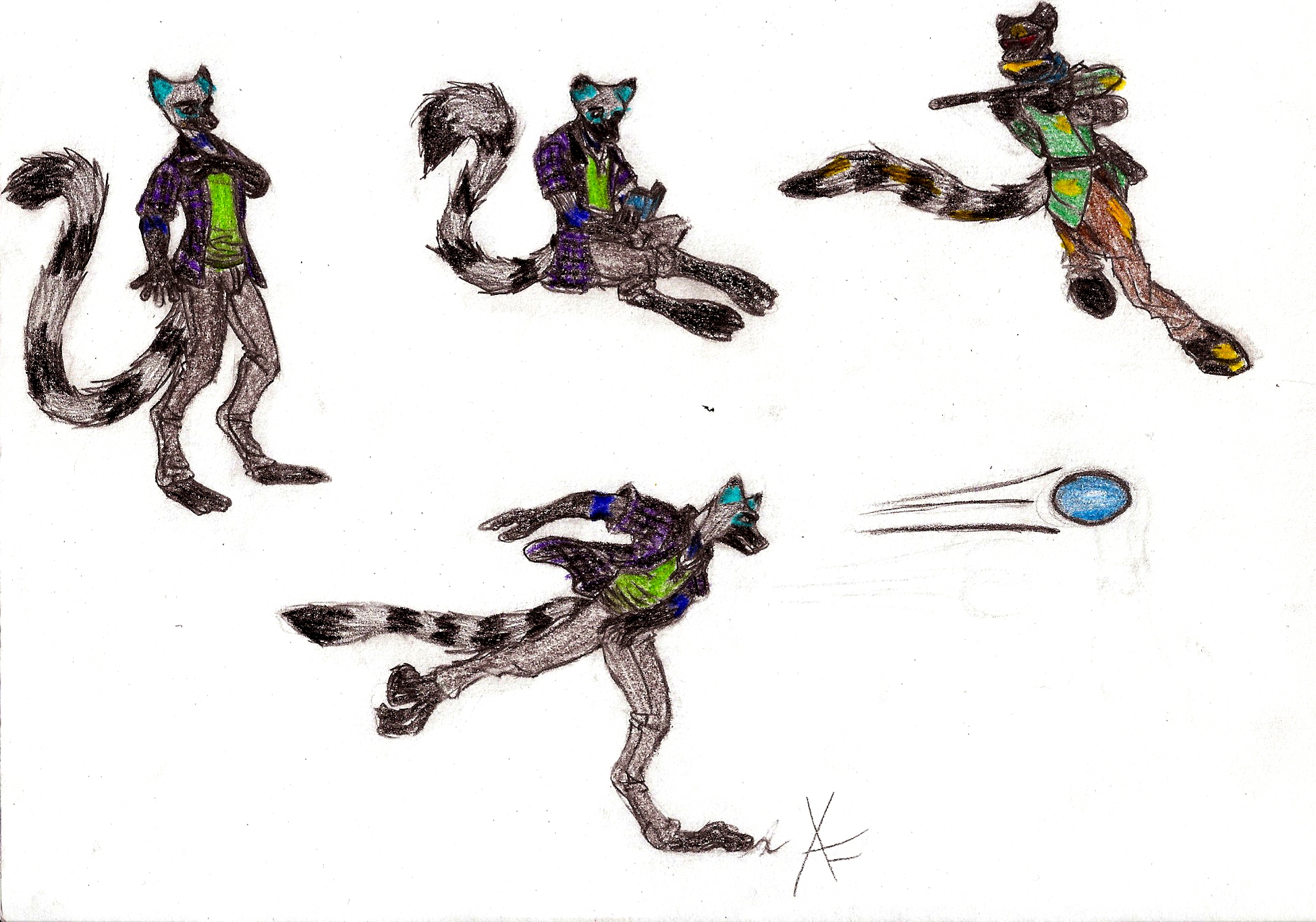
here's the finished version of the poses.
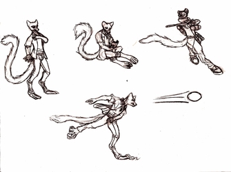
uncolored version here: https://www.weasyl.com/submission/1151118/lance-activities-pose-reference
any criticism is appreciated!
Submission Information
- Views:
- 937
- Comments:
- 2
- Favorites:
- 0
- Rating:
- General
- Category:
- Visual / Traditional
Comments
-

-

I've tried messing around with the values when I first scanned it, and this was the best I could get it. i'll admit that the lines don't look much better IRL, something that I've been trying to work on. the lines look nice enough, but when I go to color without inking it out first, the lines get smudged. when I ink the lines, the coloring show through better, but I feel like I lose detail when I'm done inking. I'm still trying to figure out how to color with colored pencils, and this was a test run, so thank you for your advice. I'll try harder with my next piece! :)
-
Link
maximask
It looks pretty cute. I like the color choices used. I'm not a great artist or anything, so I don't know what I'm talking about (haha). I actually really like the way the pencils look, but it kinda looks a little bit busy and makes some of the finer details harder to see? Maybe try mixing up values and work on bringing more highlights or shadows in to make the separate pieces pop more?
Sorry, I wish I could be more helpful, but I'm just getting back into drawing after a long hiatus since college. Keep up the good work though!