Sign In
Close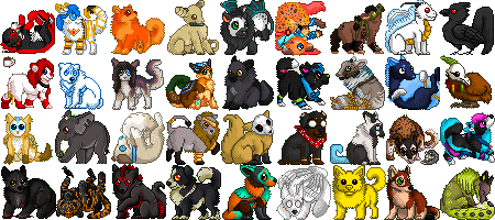

A Pokemon icon I made with my character as a sprite. My own creation. Layout inspired and referenced from Pokemon X and Y's layout. c:
Submission Information
- Views:
- 248
- Comments:
- 6
- Favorites:
- 0
- Rating:
- General
- Category:
- Visual / Digital
Comments
-

-
Yeah, Antaos is quite the detailed one. If I were being serious with these maybe I'd go back and rework it, but since it's personal art and kinda old, I don't care much for it, haha. But thank you for the suggestion! <:
-
No problem! It's because I noticed it in both icons that I reckoned it couldn't hurt to quickly point this out.
I've found that frequently zooming out to the actual size can help as well, because you can easily get fooled when working zoomed in. It's the bane of my existence when I'm trying to do really detailed works, only to find out when zoomed out it reads as pixel-clutter, meaning I have to redo it. :'D
-
ah yup yup, I pixel in MS Paint with the thumbnail showing every time I zoom in. But my eyes can get so bad when I pixel these out of insomnia in the middle of the night XD They're certainly not my best sprites. I was considering making the size that I make them in a bit bigger so I can make them clearer. It's quite a tiny space I have to work in, like 15x15 I think D: I can still usually make things look alright in 20x20. I tried going a bit bigger with this one http://fav.me/d70ygmr . It looks better, but I'm still not feeling too satisfactory with it. Might've been the colors of the character, I don't know. :'D I'll get it down at some point!
-
Ah, then I have two more quick tips if I may: Graphicsgale is a program that's been specifically made for spriting and there's a free version of it. c:
The only difference between the paid / free version is that the free version doesn't support animations, but seeing as you use MS Paint, I assume you already animate in a separate program?As for the icon you linked: the sprite actually reads quite clearly, to be honest. Plus, when you're working on such a small canvas, you can take liberties with the hues of the colours quiite a bit, as you won't be able to mark the difference between a cool shade of gray and a warm one as much as, say, on a 100x100 pixel-icon. On canvasses that small it's all about suggestion rather than explicitly adding everything. :D
-
Ah, I'll have to check that out, never heard of it :O I like my ol' MS Paint though ;3; And yes, I animate using iaza.com. Or well, I think now it's called ezimba. I have to make the frames separately as files and then put them together. Pain in the butt, but it's what I'm used to, and the normal way of doing it confuses me sometimes (or at least with what I've used before).
That's good! I appreciate you're honesty c: I'm still learning to play with hues and stuff. I'm not really the best at it I've noticed how some artists do that. Some of my idols, and even when I look at Pokemon sprites, they seem to do the same. Pixelling's a lot more than it looks! xD
-
-
-
-
-
Link
Hardrockangel
I think the overall set-up of the icon is really nice, but (if I may offer a small piece of advice): the sprite of your character is currently looking very cluttered because there's way too much detail on the sprite, making it difficult to read it clearly.
While I assume the character is a very detailed one, I think it may be worth it to try and rework that part of the icon and try to suggest the details, rather than adding them all in?