Sign In
Close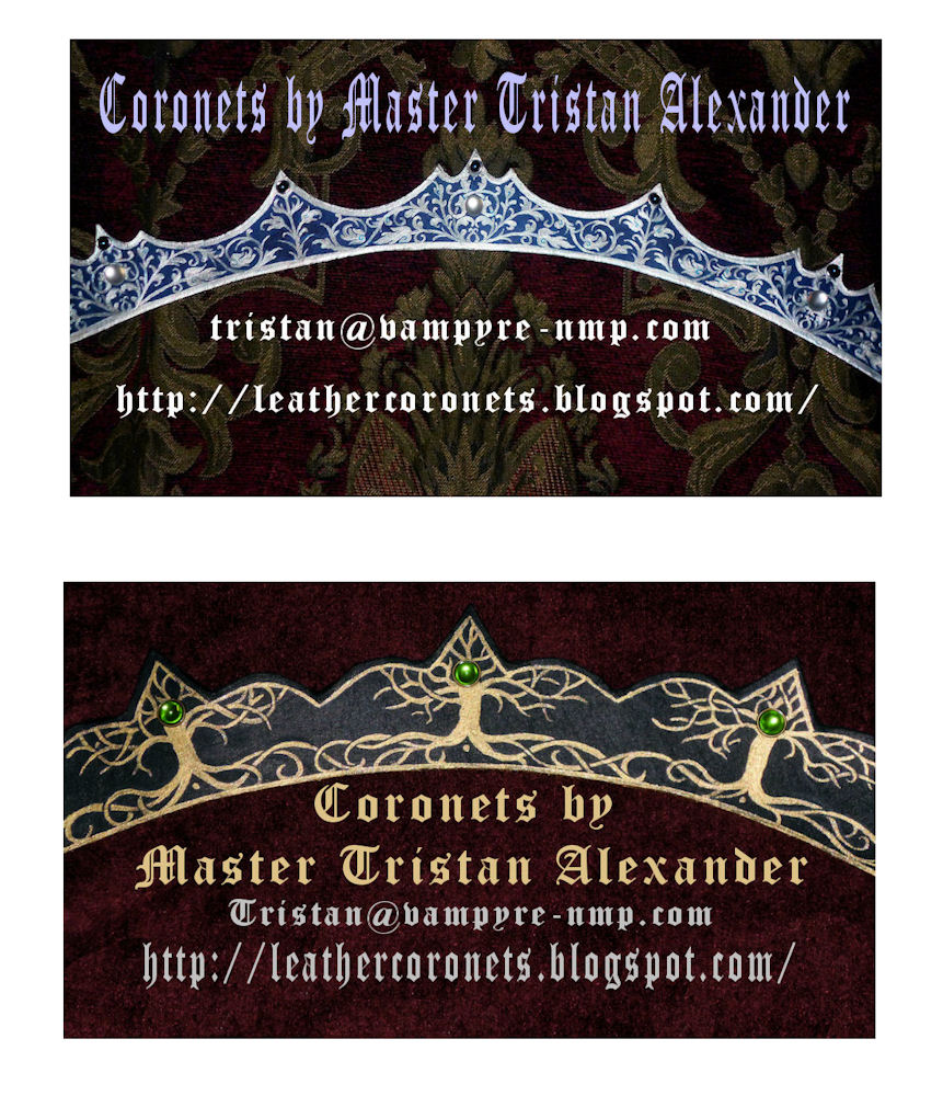


I am trying to design a business card for my leather coronet business. Here are two I came up with, I need feed back, which one is best?
Submission Information
- Views:
- 327
- Comments:
- 1
- Favorites:
- 0
- Rating:
- General
- Category:
- Visual / Other

Link
lameboat
The coronet pictured in the top card looks more immediately appealing, but bottom one is easier to read.
You may want to try a more refined approach. A more professional looking photo (better lighting, definition & cleaner lines) with a plain flat backdrop (no pattern or texture) would be a better choice to show off the work you're trying to display (especially in such a small format), and fancy font faces like what you've used here is better left to small pieces of text (like a business name). It can be confusing to decipher when it comes to important things like email addresses or website URLs, which you want to be as legible as possible!