Sign In
Close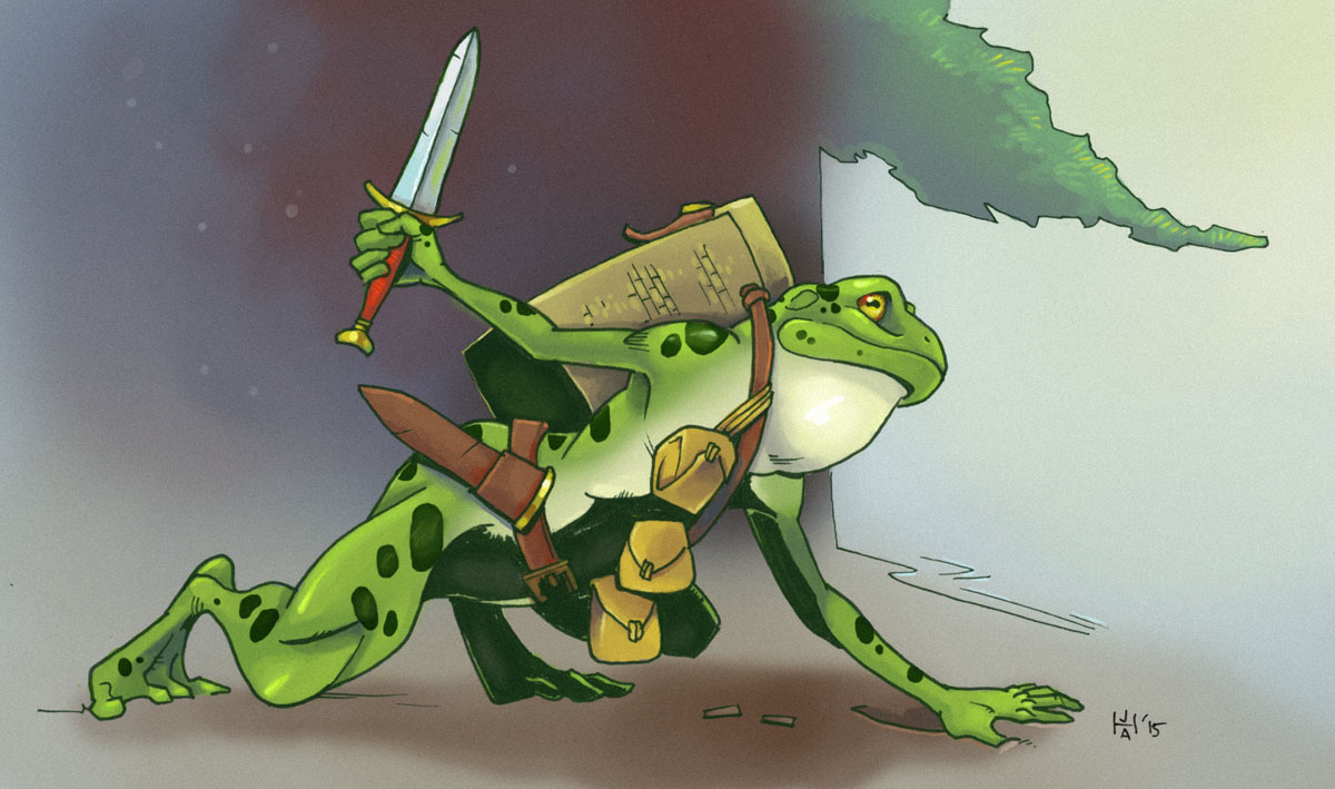
Trying to better figure out how to integrate different hues throughout a picture.
Submission Information
- Views:
- 1255
- Comments:
- 5
- Favorites:
- 15
- Rating:
- General
- Category:
- Visual / Digital
Comments
-

-
I'll be rough, but here's a rundown of what I find a little off:
- Especially his right arm looks very boney. If you go for overly skinny, don't use fleshy looks and try to emphasise bone structure insteat. The broad shoulder really kills it!
- The first bag on his ring is upside down, with the opening flap aimed downward. A bit inconsistent.
- The shading is quite nice, though his stomach feels like it shouldn't be that harsh on darkness. The curving body feels like it needs a more visible transition, a gradient.
- Look at the overall posture and it seems like his shoulders are aiming diagonally down, yet the basket on his back is parallel. Not directly noticeable, but a clear inconsistency.
- I have no idea what he's looking at, but it's a frog so I might be nitpicking.
- I quite love how bulky the legs look. It befits a froglike being!
- Again, his arms don't work well. His torso is too firm (as is his head) to fit such stick-like arms.
- His hips could've used more girth.
- Overall, his colours are great. There's really strong gradients, the highlights look amazing and I'm quite sold on the spots. However, his right arm has a very odd, bluish shading on the opper half that feels out of place next to the stark black besides it.
- Great job splitting the foot from the torso... too bad you didn't do something similar to his belt, which causes his upper leg to look weird.
- Another shading issue is his bags. They're clearly hanging in the 'dark zone' yet are as bright as the bag that isn't. This causes some spatial confusion.
Like I said, this is some ROUGH critique, but I love the picture, so I notice the bad more quickly. But truly a work to be proud of. Give yourself a pat on the back!
-

Thanks! Trying to digest all that.
-
I went a little overboard, sorry!
If you want a good tip, I've heard that mirror your image is a great way to see larger issues yourself, as the brain sees the mirrorred one as a 'new image', thus causing lingering errors to pop out!-
Thanks again! The big thing I am trying to get out of your above comment is to be more consistent with shade and lighting across elements, so I'll try and work more with that!
-
-
Link
Sapphire Crook
Frogs and amphibians are a rarity, and I see why.
Such sparkling beauty is the sign of a rare, expensive gem, if you catch my drift. ^^