Sign In
Close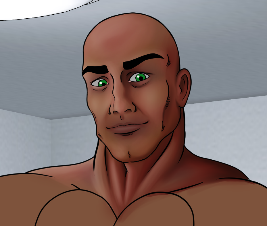

I wanted to practise a concept I like to call “multi-pass painting”, inspired by multi-pass rendering. Basically i’ve separated the skin into 4 basic layers; base colour, sub-dermal, diffuse, and specular. I think that it goes without saying that I didn’t INVENT this method (there’s this guy on the Bara image boards who did some awesome colour work on some of Bruno’s drawings that used more or less the same method), but I didn’t really understand this method too well until after comparing it to multi-pass rendering, hence the nickname.
Layers:
The base colour is just that. Just a flat skin colour (with lips).
The sub-dermal is inspired by some of the zbrush skin painting techniques i’ve seen, where splodges of red, blue, and yellow are mixed with the skin colour to give it some more realistic variation. I’m a bit undecided about this right now; i’m finding it hard to come up with a decent balance of it. I keep on switching between “too much” and “too bland”. For painting toony characters, it might be better to just limit it to red “flush” tones.
The diffuse layer is a stark white layer with red/brown shading, using one of the existing palettes Manga Studio 5 comes with. The medium tone is quite red, while the darkest tone is more brown. When the shading is done, the layer is set to Multiply and the opacity is altered to what looks rights.
The specular layer is the highlights, and is done in a similar fashion. It’s a stark black layer with light shades of red and pink (same palette again). This layer is set to Screen and the opacity is altered. Nice thing about doing this in it’s own layer is that it can overlap the shadows, which is useful if you’ve got multiple light sources.
For something that was a quick experiment, it came out quite nicely. In a proper, finished picture, I would probably spend more time doing some colour correction, perhaps reducing the saturation. As it is now, it’s so red that it’s looking dangerously close to that no-skin muscle giant from Attack On Titan.
As a concept though, it’s definitely one I can get down with. It makes managing the painting so much easier. I just have to get better at using the watercolour brushes now.
Submission Information
- Views:
- 377
- Comments:
- 0
- Favorites:
- 0
- Rating:
- General
- Category:
- Visual / Digital