Sign In
Close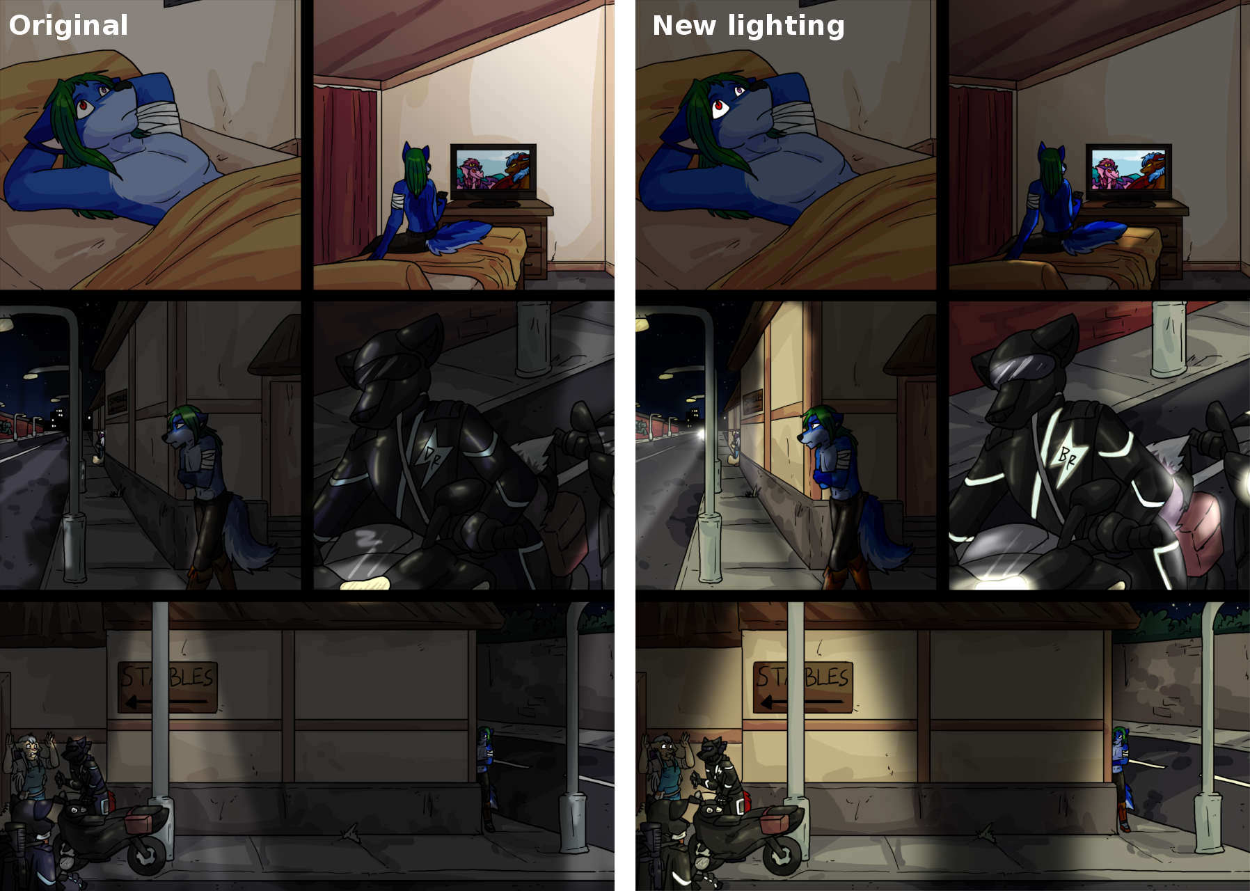

Finished page with captions is here: http://projectfuturecomic.com/darklord.php?strip=02-10
Okay, this is a page from my 'Dark Lord Rising' comic, which is a loosely-interpreted parody of Lord of the Rings but set in the mixed medieval-modern setting of DMFA. This page and the previous one (that's not filler) roughly corresponds to chapter 10, 'Strider'.
So, this page had a lot of post work done on it, which occasionally happened on things like the guillotine scene in 'Heads you lose' but is a first for 'Dark Lord Rising'.
Basically, Merlin sent me this page with PNG and a PSD versions in case I spotted anything that needed fixing. Unfortunately I did, and to make things more awkward, the lighting in the PSD version was using some advanced layer mode that Gimp couldn't parse, even in the 2.9 series.
So, after making the corrections (things like the 'DR' logo on the Black Rider's barge), making the reflective patches glow and so forth, I ended up having to rebuild the lighting from scratch.
This also let me do the eye-glow effect (Furres' do reflect light in the dark like cats and dogs, e.g. http://dmfa.katbox.net/comic/1264 ).
I guess I went a bit overboard, constantly changing the colour grading and thinking of new effects and ways the lighting should behave. At one point I added shadows behind the streetlamps but the large number of lightsources in panel 3 made this far more complex than I had initially thought and I backed those changes out.
I'm still a little mixed about how panel 3 ended up, though I am rather proud of the TV light sourcing in panel 2.
Artwork mostly by :, story and lighting by me.
Submission Information
- Views:
- 586
- Comments:
- 0
- Favorites:
- 1
- Rating:
- General
- Category:
- Visual / Digital