Sign In
Close#TailiDraws - Practice and Experimentation by tailisup (critique requested)

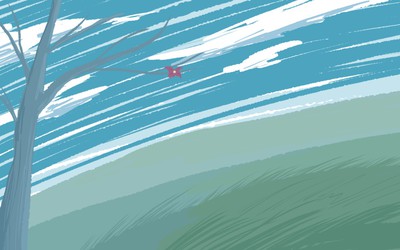
I wanted a rocky outcrop overlooking a valley and ended up with a lake/beach instead but I like it so I don’t mind.
Critique and opinions welcome please.
2014©Rob P. - www.feilanx.com
Reminder that I am open for commissions! Click here for more information.
Submission Information
- Views:
- 363
- Comments:
- 4
- Favorites:
- 0
- Rating:
- General
- Category:
- Visual / Digital
Comments
-

-

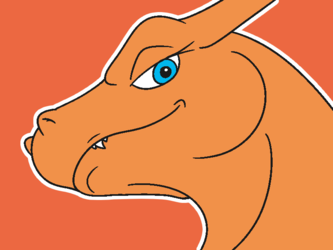
Yea I originally had them much more robust but decided to shrink them down as I believe, in a comic setting, they would be a bit overpowering?
I might have made that clearer in the commentary but I derped. All this is practice to implement later into the comic I've had in the works for years now. trying to come up with something simple, quick, and easy that looks decent but isn't too detracting from what's actually important, the comic's story itself.
-
Link
textubs
I like the composition a lot. The forms are a little too loose for my liking, I feel like there isn't enough defined negative space as a result. I would suggest making the tree foliage, clouds, and grass shading into larger and more solid forms.