Secondly, may I suggest that you try to achieve more clarity with your line art and shading. Sometimes, a slightly sketchy line art quality is perfect and it's never really a bad thing but I guess it's the soft pastel colors in the background that make it more noticeable?? It's actually easier to get a crisper style if you set the brush, pen, ect. to smaller settings (generally I set my pen to 1 or my marker to 3 or 4). But it also depends on the style you're trying to convey.
And as for the colors, they're very soft and suitable for this particular pic but maybe try blending with brush tool and mixing the colors together with themselves using a combination of playing with the density, dilution, and persistence settings. Don't use dodge, burn, or blur until you've learned to color and blend with just the brush and colors (and I have no idea if you used these--just throwing assumptions into the air). These are things that I'm still working on myself :)


Link
RaccoonLagoon
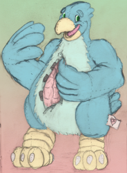
First of all, this is a really cute pic :D
Secondly, may I suggest that you try to achieve more clarity with your line art and shading. Sometimes, a slightly sketchy line art quality is perfect and it's never really a bad thing but I guess it's the soft pastel colors in the background that make it more noticeable?? It's actually easier to get a crisper style if you set the brush, pen, ect. to smaller settings (generally I set my pen to 1 or my marker to 3 or 4). But it also depends on the style you're trying to convey.
And as for the colors, they're very soft and suitable for this particular pic but maybe try blending with brush tool and mixing the colors together with themselves using a combination of playing with the density, dilution, and persistence settings. Don't use dodge, burn, or blur until you've learned to color and blend with just the brush and colors (and I have no idea if you used these--just throwing assumptions into the air). These are things that I'm still working on myself :)
I hope this was helpful? *nervous laughter*