Sign In
Close
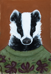
pastel chalks, color study
Submission Information
- Views:
- 573
- Comments:
- 7
- Favorites:
- 10
- Rating:
- General
- Category:
- Visual / Traditional
Comments
-
-

It looks like a photo! :o The green tone stands out to me too, although I feel like some tiny, sparing darker bits right where the shadows go deepest would help the dimension pop.. if not that, then maybe bringing the lighter colors a touch closer in?? that's my tidbit of critique, hehe. it's hard to imagine changing it though, it already looks amazing. :3
-

Thank you so much! Honest critique takes quite a bit of effort and is not easy to come by c: And yes, you are absolutely right. It was part my lacking selection of chalks, and part my poor planning, that had it end up this way.
-
No problemo, hehe. I totally understand if you had limited stuff to work with, and that makes what you achieved even greater. I love that kind of stuff--working with limitations and seeing how far one can go.
-
-
-

Hands are SO hard (for me and many others), these look very good! Well observed and well rendered.
Link
gulotakinses
looks well done to me (not that I can draw human anatomy to save my life)...... Loving the sickly green shade in the shadows of the hands, almost looks diseased, but in a fascinating way!