Sign In
Close
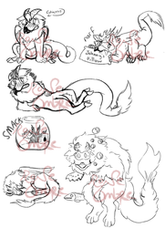
So I wanted to try drawing in another style and see how it turned out and I do love doing side by sides, so here's what i came up with, I kinda went a bit overboard with the shading and the background but oh well.
I'll leave you to guess what you think that style on the left is supposed to be like, for mine is the one on the right.
Pestilence©:Rone-Ombre:
Submission Information
- Views:
- 239
- Comments:
- 1
- Favorites:
- 2
- Rating:
- General
- Category:
- Visual / Digital
Link
Overfix8
Is the one on the left Tim Burton? The swirly motif and skinny, pointy features makes me think of Burton. Either way, this is a really good style emulation!
I also like the subtle plague doctor mask they have for a face. I almost didn't see it.
As for critique, I'm gonna focus on the shading. There's a bit of a pillow-shading issue, it'd look better to pick a direction for the lightsource. In this case, I'd pick upwards (so the shadowing would be on top), I think it'd work with the creepy characters. It's also generally a good idea to use a different color for shading (I will never say 'always do this' when it comes to art), or at least a darker shade of the main color. Like for his skin I could see blue or purple being used.
I'd recommend another brush for this too. Is this airbrush or dodge/burn? In any case, try to give the shading/light a solid color first (like with pen) and then blend it. I don't know what program you're using so I can specific what to blend with, but you probably know what brushes will do that.
I hope this helps!