Critique, huh. I don't do this much but why not, have a random critique from someone you've never heard of! :P
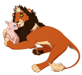
There seems to be a certain sense of 3D-ness/form to the head/eyes/face which is nice. I'm a little dubious about the sky/background colors...they feel kind of flat, washed out, in a bleh sort of way. (Is the ground sand? Dusty earth? Could you have greens covering the ground and surrounding his paws, rather than having a rather sharp and arbitrary-seeming line of grass on the 'horizon'? Just thoughts.) I feel like a darker (+ perhaps more saturated) background in general might be nice. Also, there's that thing where colors can change hue/saturation as they get lighter and darker, rather than just being flatly lighter or darker. Dunno how much you need that here, though, to be honest.
One other thing is that I think I thought the left ear, due to positioning, was some part of his back, almost a saddle or something, for a moment. I'm also unsure if it wouldn't be rotated more forward or not. For composition, I might crop the image in a bit on the left and extend it a bit to the right (or just move the character left) so there's some open space in the direction he's focused, rather than being almost right up against the edge of the picture. This would cut off the end of his tail a bit, probably, but I feel like it would make the image stronger.
I don't claim to be any sort of expert on any of this stuff, though, so don't take me TOO seriously.


Link
greyongrey
Critique, huh. I don't do this much but why not, have a random critique from someone you've never heard of! :P
There seems to be a certain sense of 3D-ness/form to the head/eyes/face which is nice. I'm a little dubious about the sky/background colors...they feel kind of flat, washed out, in a bleh sort of way. (Is the ground sand? Dusty earth? Could you have greens covering the ground and surrounding his paws, rather than having a rather sharp and arbitrary-seeming line of grass on the 'horizon'? Just thoughts.) I feel like a darker (+ perhaps more saturated) background in general might be nice. Also, there's that thing where colors can change hue/saturation as they get lighter and darker, rather than just being flatly lighter or darker. Dunno how much you need that here, though, to be honest.
One other thing is that I think I thought the left ear, due to positioning, was some part of his back, almost a saddle or something, for a moment. I'm also unsure if it wouldn't be rotated more forward or not. For composition, I might crop the image in a bit on the left and extend it a bit to the right (or just move the character left) so there's some open space in the direction he's focused, rather than being almost right up against the edge of the picture. This would cut off the end of his tail a bit, probably, but I feel like it would make the image stronger.
I don't claim to be any sort of expert on any of this stuff, though, so don't take me TOO seriously.