Sign In
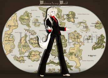
CloseHere is Shodai playing his golden Harp*---*
I made him wear more elegant clothes here^^ And well, I think they really suit him better*-*
Submission Information
- Views:
- 190
- Comments:
- 4
- Favorites:
- 0
- Rating:
- General
- Category:
- Visual / Digital
Comments
-
-

Ahh, thank you so much*--*
Yeah, that’s right, I do the outlines in Vector (back then I used Freehand MX, the pic’s around 4 years old^^ now I use Illustrator CS4)^^ But I colour in Photoshop^^
And yeah, I used a ref for the harp, since I’d never be able to draw a harp from memory (sketches are no problem, but detailed pictures are)Taha, everything that comes to your mind^^ anatomy, colouring, outlining etc, diesn’t mattr^^ even though it will be more helpful for me, when I finally upload my recent pictures, and get critique on them, but I also love critique of old art, to see, if I’ve improved with some things^^
-

ah ok! i didn't know it was old art
illustrator gives me Brain Cramps but in concept I love it so much .... i've only started seriously working with vectors fairly recently so i don't have much experience with/knowledge of Back In The Day vector softwareyou might've fixed it in newer stuff for sure, but a thing that jars me in this pic is the very light, high-key player-- especially their outlines-- in contrast to the darker, richer backgrounds, surroundings and even clothes. their features are 'ghostly' and a lil hard for me to make out-- blending in some of the surrounding browns for unity would fix it easily.
i'm still ogling that harp, you're good at use of vector!
-

Taha, I hated Illsutrator so much since it killed Freehand XD Freehand was so much better back than, compared to the past Illustrator version. I learned to use vector at work, since I'm a cartographer and we practiced creating maps with vector programs. It's not that hard, if you finally get the f***ing program to obey you XD It makes it easier to correct and change outlines later while outlining^^
Ah well, I had a very dark monitor back then and overlighted it XD on my current Laptop monitor it also looks much too light. I'm trying to darken outlines more now. You'll see in my newer stuff, when I finally make it to upload everything (I'm lazy XDD)
I always colour the outlines in a slightly darker colour than the colour inside, that makes it sometimes harder to shade as if I would use black outlines everywhere. But I do my best to improve, and I'm also using calligraphic outlines now^^ like in this pic here: http://www.furaffinity.net/view/12289979/ (on FA, since I have all art uploaded there^^)But 'ghostly' sounds quite suiting for him, since he's dead XDDD
Ahh, thanks so much ;A; I find it quite ugly now and always think "Argh, it could look much better, if I'd just put more effort in it" XD
-
-
-


Link
xan
the detailing on that harp is /incredible/, is it partly done in vector? completely? did you use ref (A GOOD THING)? Love That Harp
it says crit requested but im not sure what specifically you want crit on!